Three-dimensional surfaces: how textures and reliefs change the perception of furniture
Textures and reliefs react to light and change the perception of volumes. A guide to choosing balanced, functional and easy-to-maintain three-dimensional surfaces.
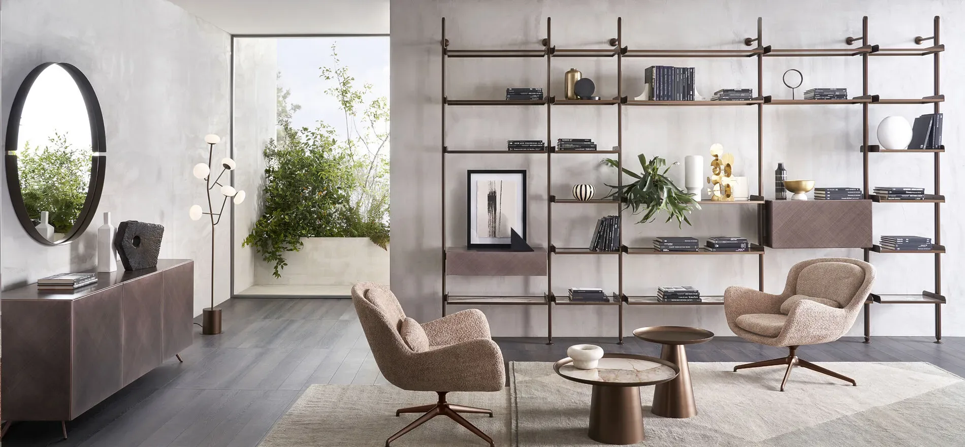
A three-dimensional surface does not simply add decoration to a piece of furniture. It affects the way volume is perceived, its relationship with light and the tactile quality of the room. Grooves, slats, engravings, folds and geometric patterns can lighten a mass, emphasize its depth or turn a uniform front into an architectural feature.
The effect depends on scale, rhythm, material and lighting. A very dense relief can create visual noise; a very deep one increases shadows and presence; a delicate texture only emerges up close. To use these surfaces with balance, it is important to understand how they behave throughout the day and how they relate to floors, walls, textiles and other furnishings.
From a flat surface to a field of light and shadow
On a uniform plane, light mainly describes colour and degree of opacity. On a worked surface, instead, every variation creates illuminated areas and shadows. The furniture changes appearance depending on the viewing angle and the position of the light source. Three-dimensionality therefore introduces a dynamic component even into a static object.
Grazing light makes relief more evident because it lengthens shadows. Diffused frontal light softens it and gives a more uniform impression. During the day, sunlight can transform perception several times; in the evening, lamps and spotlights establish a more controlled effect. The design of the surface should move together with the lighting design.
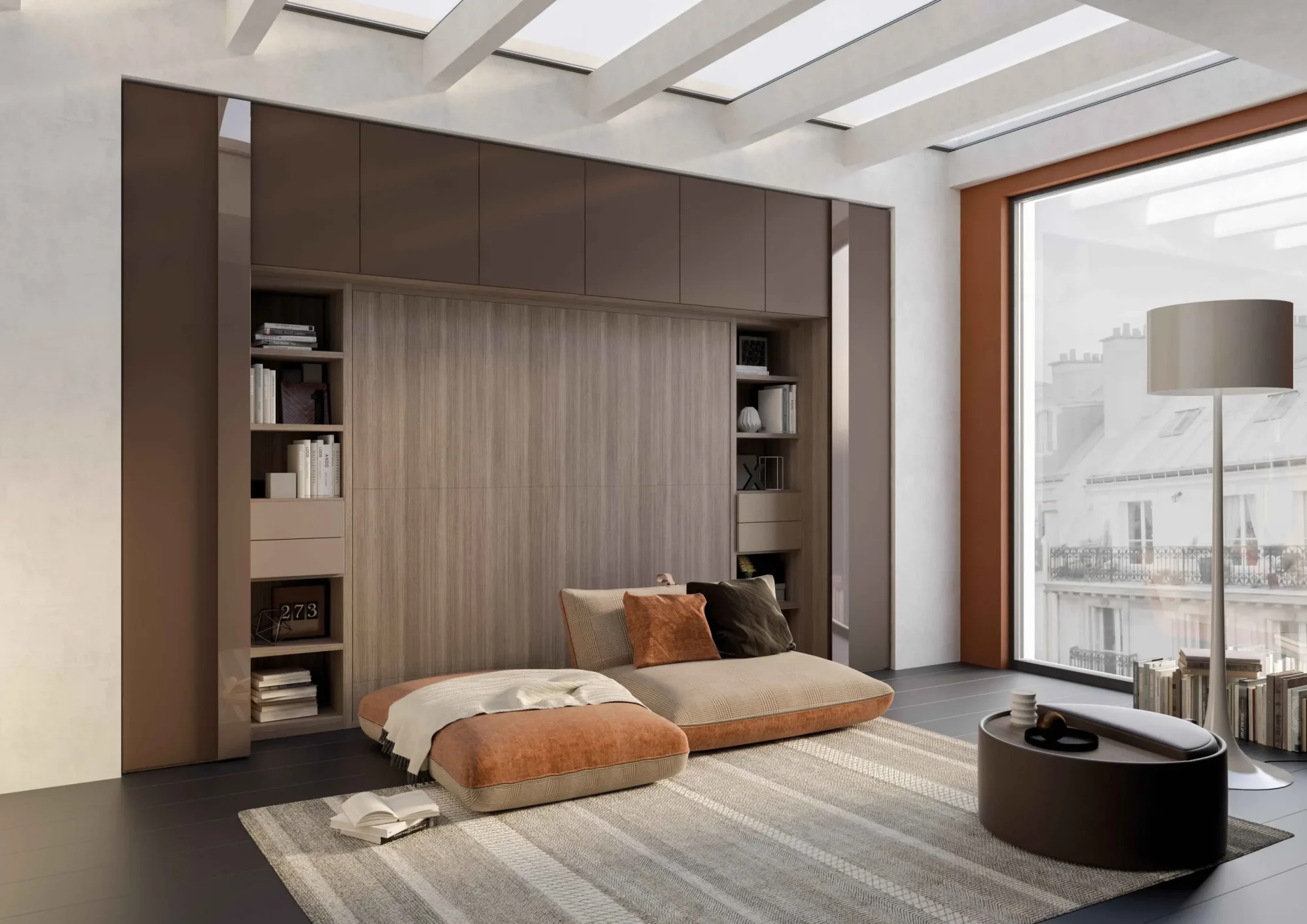
Maximum contrast is not always desirable. In an essential living room, a texture that is readable only at close range can add depth without becoming the main feature. On a large storage wall, a stronger rhythm can avoid the effect of an indistinct block. Quality lies in the correspondence between the intensity of the relief and the role of the furniture.
The scale of the pattern in relation to the furniture
The size of the pattern changes the perception of proportions. Narrow vertical grooves can emphasize height; horizontal bands extend width; large and regular modules strengthen the presence of the volume. A small design produces a continuous vibration and tends to be perceived as texture rather than geometry.
Scale should be chosen by observing the furniture from different distances. A detail that is effective up close may disappear from the entrance of the room; a very large pattern may be interesting from afar but excessive in everyday use. Small samples do not always represent the final effect, especially when repetition is decisive.
It is useful to draw the whole front and check where the pattern is interrupted by doors, drawers, recessed grips and handles. A repetition that ignores construction divisions creates misalignments. When rhythm and modules coincide, the surface appears more precise.
Rhythm, direction and visual order
Three-dimensional textures introduce rhythm. Regular repetitions convey calm and continuity; controlled variations create movement; irregular sequences produce a more expressive character. In a contemporary living room, rhythm should dialogue with floor joints, wall panelling, curtains and the geometry of other furniture.
Direction guides the eye. Vertical lines can make a storage unit look slimmer, but on a low sideboard they also create an interesting contrast with horizontality. Diagonal engravings increase dynamism and require more visual space. Curved shapes soften fronts and continuously change reflections.
One dominant rhythm is often enough. If wall, furniture, rug and textiles all have strong patterns, the room loses hierarchy. A three-dimensional surface works best when supported by quieter elements.
Lightening or increasing visual weight
Relief can produce opposite effects. Thin grooves, uniform colours and soft shadows fragment a large mass and make it more articulated. A deep, dark and high-contrast pattern instead increases sculptural presence. It is therefore incorrect to consider texture automatically light.
The base also matters. A suspended unit with a worked front keeps part of the floor visible and balances the richness of the surface. A volume resting on the floor communicates greater solidity. Depth of relief, colour and relationship with the floor must be evaluated together.
The background can reduce or increase contrast. A wall in the same colour family integrates the furniture; a light wall behind a dark front highlights every outline. Leaving side margins allows the texture to be read without merging with other elements.
Materials and different qualities of relief
Wood makes three-dimensionality warm and natural. Milling and slats interact with grain and colour variations, creating a complex design. It is important to control grain direction, continuity between modules and edge finishing. Deep workmanship exposes more surface and requires careful cleaning.
Lacquered panels allow a uniform colour that mainly highlights light and shadow. A matt finish softens reflections and makes the relief gentler; satin or glossy surfaces increase its variability. The precision of the support is essential, because continuous colour makes imperfections visible.
Metal, shaped glass, ceramic and composite materials offer different responses. Metal creates sharp reflections and can look technical; glass combines transparency and distortion; ceramic allows resistant textures but requires protected edges and correct integration with the furniture.
Functionality and maintenance
Every relief has practical consequences. Deep grooves collect more dust than a smooth surface; very irregular surfaces may be less suitable near working areas or frequent contact points. The choice must consider not only the initial visual effect, but also how the furniture will be used over time.
In kitchens and entrances, textures should be easy to clean, impact-resistant and compatible with suitable detergents. In the living room or bedroom, more delicate workmanship can be used, provided it is proportionate to frequency of use. Position also matters: a high front that is rarely touched can allow more pronounced relief than a low drawer used every day.
Maintenance should be explained already during the selection stage. Soft brushes, microfibre cloths and gentle vacuuming are often more effective than aggressive products. The beauty of a three-dimensional surface also depends on its ability to remain readable over time.
How to include them in a furniture project
The safest approach is to start from a hierarchy. Which element should attract attention? A sideboard, a wall system, a wardrobe, a kitchen island? If the texture has a leading role, the other materials should act as support. If instead it is meant to be a detail, it is better to reduce depth, contrast and pattern size.
Testing with real light is decisive. Looking at a sample near the window, then under artificial lighting, helps to understand whether the relief remains pleasant at different times. Photographing it from several angles can also reveal reflections or shadows that are not perceived at first glance.
Finally, a three-dimensional surface should have a design reason. It can correct a proportion, give depth to a volume, hide joints, enhance a material or create continuity with the architecture. When relief responds to a precise perceptual function, the furniture becomes more coherent.
A balance between matter, light and measure
Textures and reliefs are powerful tools because they transform a piece of furniture into an element sensitive to light and to the movement of the eye. They should not be chosen only for their pattern, but for their overall effect in the space.
The best solution combines matter, proportion, maintenance and lighting. A well-designed three-dimensional surface does not become tiring, does not weigh down the room and does not complicate daily use: it adds depth, character and a tactile quality that makes the environment richer.