How to introduce colour into the living room without compromising elegance
Learn how to use colour in your living room with balance and elegance. Discover how light, materials, furniture and proportions work together to create a harmonious palette that feels welcoming, personal and timeless.
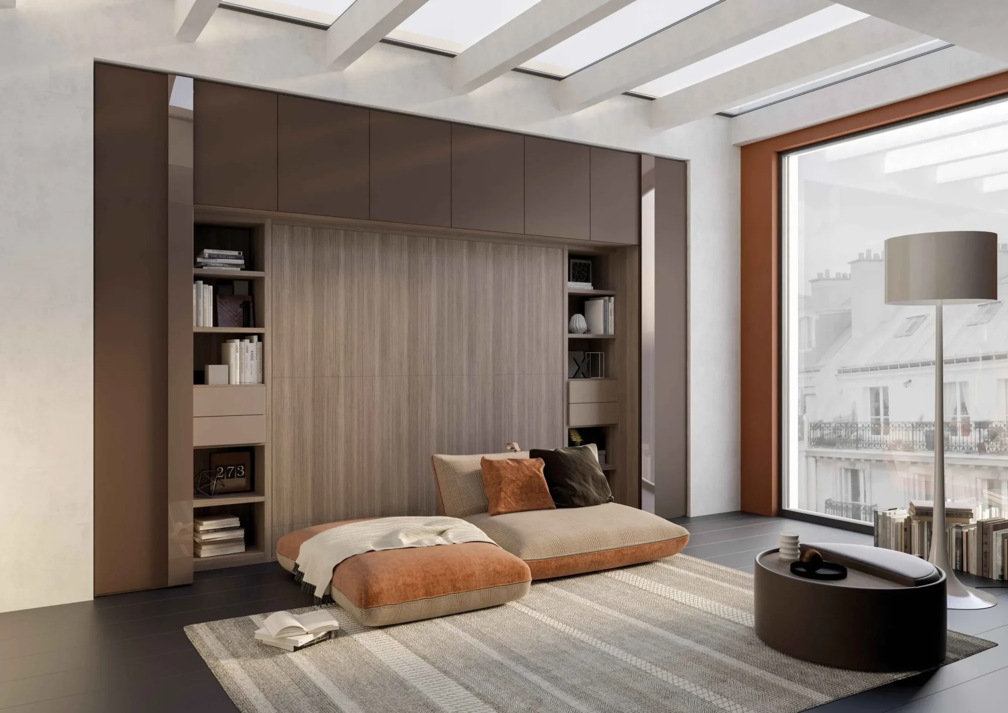
Introducing colour into the living room does not necessarily mean creating a visually loud interior. A well-designed palette can make the space more personal, welcoming, and layered while preserving elegance. The result depends less on the intensity of individual hues than on how they are distributed across walls, furniture, textiles, materials, and light.
Chromatic elegance comes from restraint. Every colour should have a role: establishing a background, highlighting a volume, connecting different zones, or introducing an accent. When too many hues compete without hierarchy, the room feels fragmented. When everything remains neutral through fear of making a mistake, the living area can lose identity. Effective design sits between these extremes and builds coherent relationships.
Begin with the room’s actual light
Colour does not exist independently of light. The same finish changes throughout the day, appears warmer or cooler, and may lose intensity in shadow. Before defining a palette, observe the orientation of the windows, the amount of daylight, reflective surfaces, and artificial illumination.
In north-facing rooms, light tends to be diffuse and cooler. Dusty shades, pale earth tones, and warm neutrals can balance this quality without making the space appear yellow. A southern exposure provides intense light and can support deeper colours, but it calls for attention to variation and material fading. Morning and evening light produce different effects, especially on reds, greens, and blues.
Samples should be viewed in several positions and over at least a full day. A small fragment seen in a showroom cannot communicate the effect of a wall or a large upholstered surface. Place it beside the floor, curtains, and existing furniture because colour is always perceived in relation to its surroundings.
Build a palette with a clear hierarchy
A balanced palette generally distinguishes a dominant tone, one or two supporting colours, and an accent. This is not a rigid formula but a method for preventing every surface from carrying equal force. The dominant colour occupies the broadest areas and establishes the atmosphere. Secondary tones connect materials and functions, while the accent directs attention.
The dominant colour does not have to be neutral. A muted green, greyed blue, or gentle earth tone can form a sophisticated background when used consistently. Moderate saturation makes substantial furniture easier to coordinate and allows light to model the surfaces. Intense colours work better when concentrated and supported by a quiet foundation.
The hierarchy should remain legible from a distance. On entering the living room, the eye should perceive the whole before the details. If curtains, rug, sofa, walls, and accessories all create strong contrasts, there is no visual pause. Reducing the number of protagonists makes every choice more effective.
Use neutrals as structure, not surrender
Neutrals are often associated with elegance, but their value depends on internal complexity. White, beige, and grey are not uniform categories. They contain warm, cool, green, pink, or earthy undertones. Combining neutrals with incompatible undertones can create a more obvious dissonance than using a bright colour.
A neutral base works when it includes controlled variations of brightness and texture. Matt walls, tactile fabrics, timber, and mineral surfaces can belong to the same colour family without looking flat. This layering allows colour to be introduced gradually and changed over time through movable elements.
The neutral foundation should support the design rather than erase it. If every object uses the same shade and degree of sheen, volumes lose definition. Gentle differences between light and dark, smooth and rough, warm and cool create depth while preserving an orderly impression.
Decide where colour should be concentrated
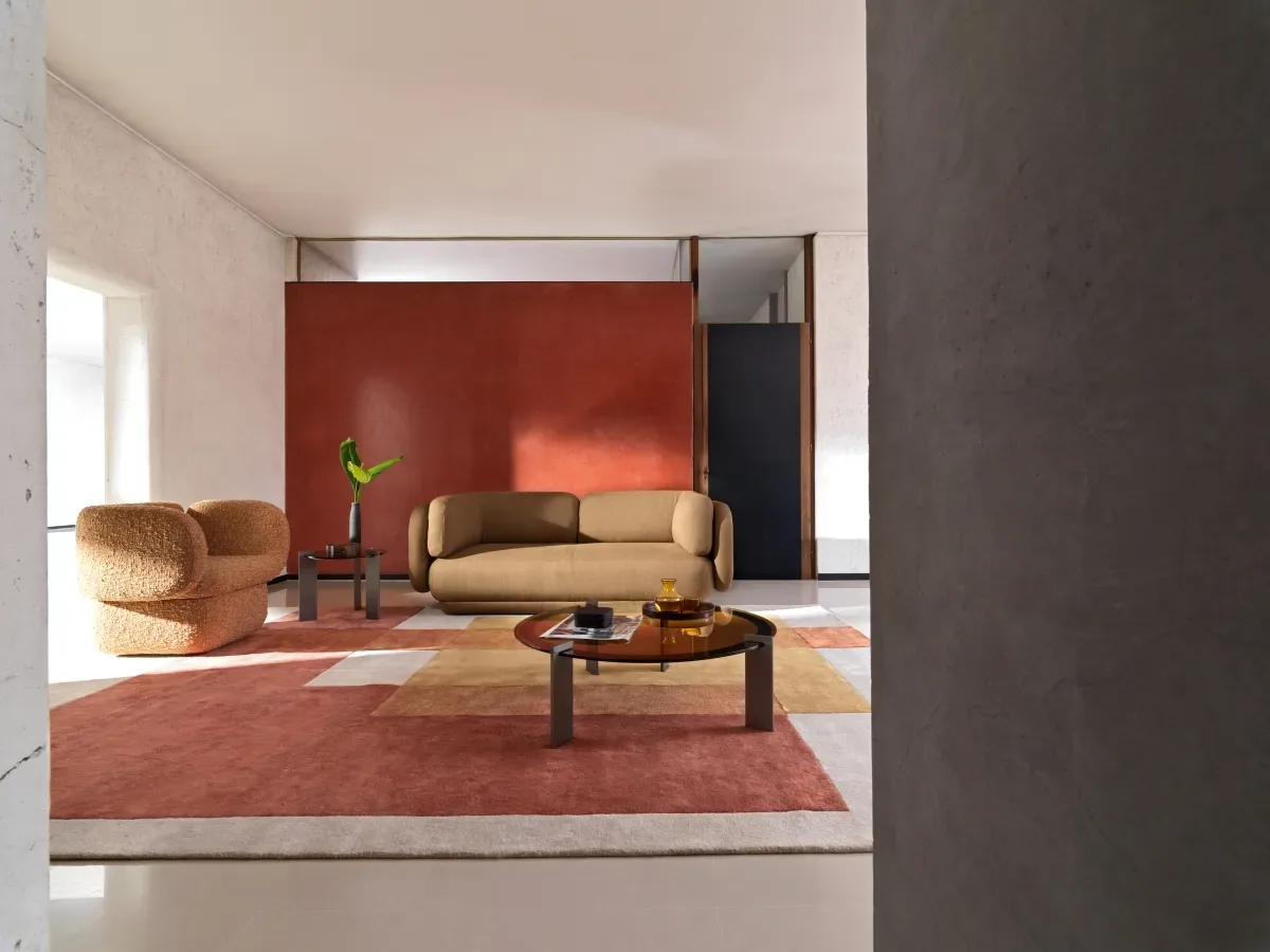
Position is as important as hue. A coloured wall changes the architecture: it may bring a plane forward, push it back, emphasise a niche, or add depth behind the conversation area. Before painting, understand why that particular surface should become prominent. Automatically choosing the wall behind the sofa does not guarantee balance.
Colour can be concentrated on a large item of furniture, such as the sofa or a storage system. This gives the room a strong identity and requires greater commitment because the volume remains visually important. Alternatively, colour can enter through rugs, curtains, armchairs, and objects, allowing easier adjustments.
An effective strategy is to distribute the same colour in different quantities. A principal area may be echoed by two or three distant details without exactly repeating the shade. The reference creates continuity and prevents the accent from looking isolated.
Apply colour to upholstered furniture
A coloured sofa has considerable impact because it combines a large surface with a central position. Mid-value, muted shades are generally easier to integrate: they change subtly with light, work with natural materials, and tolerate variations in accessories. Very pale colours show stains and shadows more readily, while very dark colours can make the volume appear denser.
Upholstery texture changes perception. Velvet makes a hue deep and shifting; a dry weave gives it a more natural character; a mélange fabric introduces small variations that simplify coordination. The choice also needs to consider abrasion resistance, lightfastness, cleaning, and behaviour over time.
If the sofa remains neutral, armchairs and poufs can carry stronger tones. Avoid mechanically matching all upholstered pieces. Colours from the same family, used at different values and in different textures, create a richer and less contrived whole.
Coloured walls and perceived proportions
Dark colours tend to make a wall more present, but not necessarily oppressive. In a well-lit room, they can increase depth and create an intimate atmosphere. Pale tones amplify light, yet without contrast they may flatten perception. The effect depends on the area involved, ceiling height, and relationship with the floor and window frames.
Painting walls and ceiling within the same family can make the interior enveloping and soften irregular boundaries. A lighter ceiling maintains more openness. A vertical band can emphasise height, while a horizontal coloured treatment changes the perceived scale. These decisions should follow the architecture rather than becoming arbitrary decoration.
Paint finish matters. Deep matt surfaces absorb light and disguise some irregularities, while more reflective finishes reveal the substrate and variations. In circulation areas, consider washability and the possibility of local touch-ups.
Treat timber, stone, and metal as colours
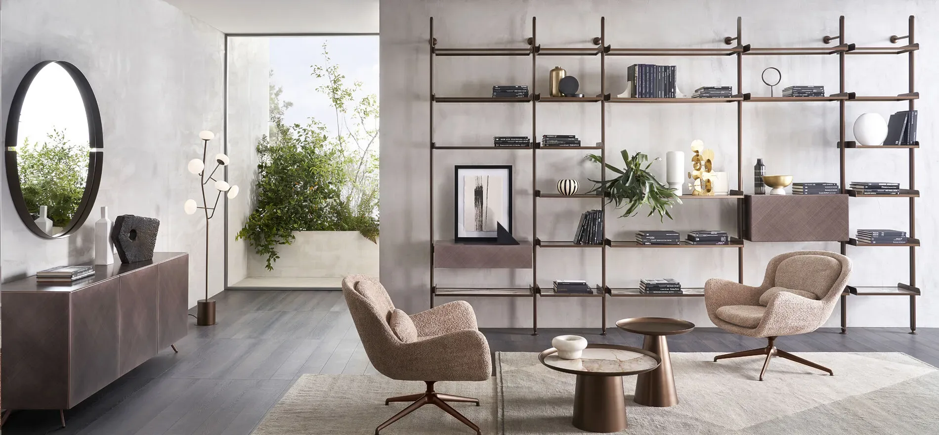
Materials are not neutral backgrounds. They have colour, grain, and reflective qualities. Pale oak introduces warm, bright notes; a dark timber adds depth; veined stone combines several shades within a single plane. The palette should begin with these elements, especially when floors or fitted furniture will remain unchanged.
Metal can operate as an accent through warm, black, or silver reflections. Small quantities are often enough to add precision. Repeating a metal finish across lamps, bases, and details creates continuity, but exact matching is unnecessary. Maintaining a coherent temperature is more important.
Natural surfaces contain variations that make colour less uniform and often more enduring aesthetically. The design should embrace these differences. Trying to match every vein to a perfectly identical sample produces rigidity; it is better to work with families and relationships.
Experiment through textiles and rugs
Curtains, rugs, and cushions introduce colour without changing the main structures. Their effectiveness, however, depends on scale. A large rug influences perception more than many small accessories and can become the starting point for the entire palette. Curtains filter daylight, so their colour spreads through the room and changes between day and evening.
Patterns should respond to room size and to the other visual signs already present. A large motif can look elegant over an extensive surface when its palette is controlled. Numerous small patterns may instead generate noise. Alternating plain surfaces and motifs gives the eye places to rest.
Cushions are useful for testing an accent, but they should not be the only source of colour. If a hue appears only in a few small objects, it seems superimposed. A reference in the rug, an artwork, or a finish makes it part of the design.
Balance warm and cool contrasts
Combining different temperatures creates depth, provided that one remains dominant. An interior with warm timber can accommodate cool blues or greens that balance its intensity. A grey base can become more welcoming through earth tones, leather, or muted pink textiles. The contrast must be tested in actual light because lamps can shift perception.
Temperature is not the same as a colour name. Warm greys, cool whites, blue-based reds, and yellow-based greens all exist. Samples placed side by side help reveal undertones. If a combination seems almost right but still lacks harmony, an undertone difference is often the cause.
A small amount of the opposite temperature can enliven a monochromatic palette. The contrast does not need to be distributed evenly. Concentrating it in one area and repeating it discreetly preserves elegance.
Connect the living room to adjacent areas
In open spaces, colour should support movement between different functions. Living, dining, and kitchen zones may have distinct identities but need a shared element: a background hue, timber, metal, or level of saturation. Without this connection, the open plan looks like a collection of separate sets.
Continuity does not require identical repetition. A deep green in the living room can become lighter in the dining area. An earth tone used in a rug can reappear on chairs. A shared neutral may connect walls and storage. Varying quantities and materials prevents an overly coordinated result.
Views through doorways and corridors also deserve attention. The colour of one room frames the next. Designing these relationships creates a coherent home and makes it possible to use more distinctive shades without compromising the whole.
Artificial lighting and colour rendering
In the evening, the palette depends on the lamps. Very warm light softens blues and greens while intensifying reds and yellows. More neutral light preserves greater fidelity but may feel less intimate if used without varied layers. The best approach combines atmosphere with an accurate perception of materials.
Colour rendering indicates how faithfully a source reveals hues. Good light quality is preferable in a carefully designed living room, especially near textiles, art, and tactile surfaces. Different fixtures should maintain compatible colour temperatures to prevent inconsistent zones.
Grazing light emphasises texture and irregularities, while diffuse illumination unifies. Lighting a coloured wall can increase its depth; leaving a large dark object in shadow makes it seem heavier. Lighting placement should therefore be tested alongside the palette.
Aesthetic longevity and future change
A colour can feel contemporary without depending on a short-lived fashion. Shades connected with natural materials, landscape, and mineral pigments often retain balance because they have complexity and moderate saturation. This does not mean avoiding intense colours, but placing them where they can be updated without transforming the entire living room.
Longevity also depends on material quality. Fabrics with poor lightfastness, paints that are difficult to touch up, and delicate surfaces can quickly lose uniformity. Maintenance, exposure, and the availability of replacements are part of the chromatic decision rather than later concerns.
A coherent underlying structure supports gradual evolution. Rugs, artworks, cushions, and small furniture can change while the main walls and large volumes retain their role. The room can then renew itself without losing identity.
Colour mistakes to avoid
The first mistake is choosing every colour separately. A hue may be attractive in isolation yet incompatible with the floor, light, or textiles. The second is pursuing perfect matches between all elements, which makes the room rigid and shallow. It is better to coordinate colour families with gentle variation.
Another mistake is distributing accents uniformly. If every corner contains the same amount of colour, hierarchy disappears. Relying on numerous small objects also causes fragmentation. It is more effective to concentrate the hue on a meaningful surface and use quieter echoes elsewhere.
Finally, maintenance should not be ignored. Very pale colours on heavily used surfaces, dark finishes that reveal dust, or delicate fabrics in direct light may demand care that is incompatible with daily life. Elegance needs to remain sustainable in use.
Elegant colour is designed colour
The living room gains character when colour is treated as part of the architecture rather than as a final decoration. Light, scale, materials, texture, and function determine how much space each shade should occupy and where it belongs.
A coherent foundation, a few well-positioned accents, and carefully distributed references overcome the opposition between a neutral room and a colourful one. The result can be personal and intense without losing order. Elegance comes from this awareness: every colour has a reason, a proportion, and a relationship with the whole.