Generous volumes and essential lines: finding the right balance in the living room
Generous volumes can retain a restrained aesthetic when proportions, empty space and materials are carefully calibrated. Explore how to keep the living room balanced and legible.
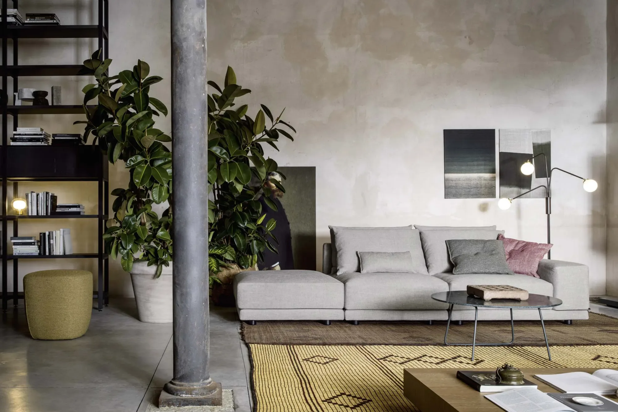
The contemporary living room brings together two needs that may initially seem opposed. On one hand, people want welcoming furniture that offers comfort and presence; on the other, they seek a visually clean, orderly, and light composition. The balance between generous volumes and essential lines does not come from indiscriminately reducing the number of elements. It requires careful work with proportions, distances, materials, and hierarchy.
A deep sofa, an enveloping armchair, or a large low table can become the natural centre of the room without making it feel heavy. Problems arise when every object demands equal attention, surfaces are excessively fragmented, or dimensions obstruct circulation. To avoid this effect, it is useful to distinguish physical size from visual weight. A substantial piece can appear lighter through a recessed base, uniform upholstery, or a carefully measured area of open space around it.
Read the architecture before choosing furniture
The room itself is always the starting point. Floor area, ceiling height, openings, daylight, and connections with adjacent spaces determine how much volume the living room can support. A large room crossed by several routes may require more restraint than a smaller but regular interior. Perimeter measurements alone are therefore insufficient.
Identify the main views: the entrance, the perspective from a doorway, the relationship with a window, and the connection to the dining area. The most substantial furniture should support these views rather than block them. If the first thing seen on entering is a tall side panel or a sequence of high backs, the room may feel smaller than it is. A layout that allows depth and light to remain visible creates a sense of openness.
Technical constraints should be included in the initial reading. Radiators, sockets, lighting points, sliding doors, and curtains all need operational margins. Ignoring them often results in compressed furniture, exposed cables, or improvised solutions that undermine visual clarity. A scale plan, supported by simple elevations, helps assess not only occupied floor space but also perceived height and mass.
Generous volume does not mean excessive bulk
A substantial volume can improve the living room when it answers a genuine function. A wide seat supports relaxed postures; a capacious storage unit reduces the need for several small cabinets; a large rug gathers different pieces into one coherent zone. Generosity becomes problematic only when it lacks a precise purpose or limits freedom of movement.
The assessment should consider three dimensions: footprint, height, and depth. Two pieces of equal width can have very different effects if one is raised above the floor and the other reaches it, or if one has a low profile while the other presents a tall back. Perception also depends on surface continuity. A uniform block is read as a clear gesture, while numerous divisions, seams, or colour changes multiply visual noise.
The most effective choice is often to concentrate presence in a few well-proportioned elements. A large sofa accompanied by light tables may look more orderly than a sequence of small seats. In the same way, one storage system can resolve several functions with greater clarity than a collection of independent units. Reducing fragmentation makes it possible to preserve comfort and capacity without losing simplicity.
Essential lines mean clarity, not austerity
Essential does not mean cold, empty, or without character. In contemporary design, an essential line is a legible one: it defines volume without unnecessary decoration and allows proportions, materials, and construction details to create quality. The result can be soft and welcoming as long as the form remains coherent.
Continuous profiles, precise junctions, discreet bases, and a limited number of material changes all contribute to clarity. A rounded form can be essential when its radius is controlled and repeated logically. Conversely, a rectilinear object can appear complex when it combines too many thicknesses, finishes, or accessories.
Simplicity requires selection. Every detail should have a perceptual or practical function. A seam may follow the geometry, a recessed foot can lighten the base, and an integrated handle can preserve the continuity of a surface. Removing what is unnecessary does not impoverish the object; it makes the quality of what remains more visible.
Establish a visual hierarchy
A balanced living room has a centre and a series of supporting elements. The centre may be the conversation area, a fitted wall, an external view, or an artwork. It does not need to occupy the geometric middle of the room, but it should be recognisable. Without hierarchy, the eye travels from one object to another without finding structure.
If the sofa is the dominant volume, tables, lamps, and accessories should support it through smaller dimensions, transparency, or slender profiles. If the storage wall has a strong architectural presence, seating may use quieter colours and continuous geometry. The principle is to prevent several equivalent masses from competing.
Hierarchy can also be established through empty space. Leaving part of a wall free or providing a wider margin around the main item strengthens its role. This margin is not wasted space. It allows the outline to be read, facilitates circulation, and gives the overall composition greater authority.
Proportion and relationships of scale
Every element must be assessed in relation to the others. A very small table in front of a deep seat looks accidental and is often impractical. A fragile-looking lamp beside a large volume may lose presence. A rug that is too short interrupts the continuity of the conversation area. Balance depends on relationships, not on measurements considered in isolation.
Human scale remains a fundamental reference. Seat heights, reaching distances, and depths should support natural gestures. A room can be visually impressive without forcing people into awkward routes or uncomfortable postures. Design quality is most apparent when visual and ergonomic proportions coincide.
Templates on the floor can help control scale, while temporary objects can simulate height. This exercise immediately reveals imbalances. The room should be observed while seated and standing, from the entrance and from connected spaces. Furniture is never perceived from only one position, and its impact changes as people move.
The decisive role of empty space
Generous furniture needs open space to be perceived correctly. A substantial volume requires enough distance from walls, other furniture, and circulation routes for its form to remain distinct. When objects stand too close together, their outlines merge and the room looks crowded even if the individual pieces are refined.
Empty space also performs a practical function. It enables doors and drawers to open, allows cleaning, makes room for moving a chair, and provides access to windows. Main routes should be continuous. Secondary passages may be more compact, but they should not force people to turn sideways or brush against corners.
In an open-plan interior, open space may separate functions more effectively than a physical element. A clear strip between living and dining areas defines both while maintaining continuity. The back of a low sofa or a correctly sized rug can establish a boundary without closing the perspective.
Use colour and materials to lighten mass
Colour changes the perception of volume. Light and medium tones reflect illumination and soften outlines, but they are not the only answer. Dark furniture can also feel balanced when placed against a coherent background, lit correctly, and surrounded by lighter surfaces. Strong contrast increases presence, while a closely related palette creates continuity.
Texture has an equally important effect. Tactile fabrics absorb light and communicate warmth. Smooth matt surfaces define precise geometry. Glass and metal introduce reflections and lightness, although they need restraint to prevent the room from feeling cold. Wood can connect larger masses through the direction of its grain and its natural tonal variation.
To preserve an essential atmosphere, limit the palette and repeat materials thoughtfully. The same finish can appear in distant parts of the room, connecting seating, tables, and storage. Everything does not need to match. It is enough for colours and textures to share temperature, intensity, or degree of sheen.
Bases, feet, and distance from the floor
The relationship with the floor has a major influence on visual weight. A volume resting directly on the ground conveys stability and compactness. A raised structure lets light pass beneath it and reveals more of the floor. Neither approach is always preferable; the decision should respond to the total amount of mass in the room.
When a sofa is particularly deep, a recessed base can make it seem to float without weakening its sense of solidity. Wall-mounted cabinets free floor area and simplify cleaning, but they require suitable walls and fixings. Tables with slim structures can counterbalance substantial seating; by contrast, a more monolithic table can stabilise a collection of light elements.
Avoid the accidental repetition of too many support types. Angled legs, sled bases, solid plinths, and suspended structures can coexist only if they share a criterion such as colour or thickness. A limited family of solutions makes the design easier to understand.
Lighting and the perception of volume
Light does more than make the room visible. It models volumes and changes their presence throughout the day. Diffuse light softens contrasts and unifies the interior. Grazing light highlights texture and relief. A directed source creates hierarchy. In the living room, several layers can be combined without filling the space with fixtures.
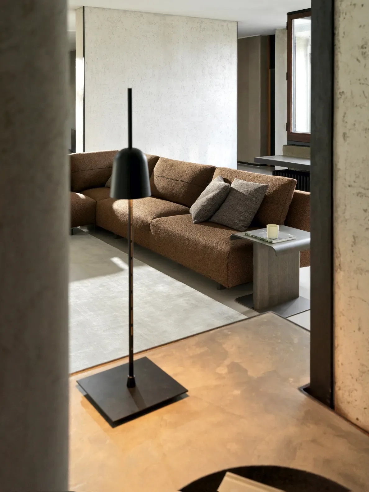
Floor lamps can balance a large sofa if their scale is appropriate. Pendants and integrated lighting define tables and walls without taking up floor area. Indirect light behind furniture or along a wall increases depth and reduces the effect of an overly compact mass.
Shadows also deserve attention. Dark furniture in a poorly lit zone can lose definition and become an indistinct block. Lighting the background or leaving a margin from the wall helps separate planes. Lighting design should therefore develop alongside furniture planning rather than being added at the end.
Comfort and everyday order
Aesthetic balance must withstand daily life. An essential living room without storage quickly fills with visible objects. Closed compartments should be provided for items that do not need to remain on display, while a limited number of open spaces can hold a deliberate selection. Baskets, tables with storage, and integrated units support habits without multiplying furniture.
Textiles also require restraint. Cushions and throws make generous volumes more welcoming, but their number and colours should be coordinated. A few carefully selected pieces enhance depth and comfort. Excessive layering conceals the lines and makes maintenance more demanding.
Durable materials, upholstery suited to the intensity of use, and surfaces that are easy to clean help preserve visual order. Simplicity should not be a static condition that has to be recreated constantly. It should be supported by furniture functions and by a realistic understanding of life at home.
Mistakes to avoid
One common mistake is associating elegance with the presence of many important objects. When the sofa, armchairs, table, storage, and lamps all have a large scale and strong contrast, there is no pause. It is more effective to select one or two protagonists and give the remaining pieces a complementary role.
A second mistake is using only pale colours in the hope of lightening the room. If proportions and distances are wrong, colour cannot solve the problem. Carefully positioned contrasts can instead clarify structure and add depth. Undersized rugs, extremely small accessories, and walls occupied from end to end should also be avoided.
Finally, essential lines should not be confused with an absence of comfort. Reducing backs, padding, or support surfaces without considering everyday needs creates an interior that is formally clean but difficult to inhabit. True simplicity is the result of precise decisions, not automatic subtraction.
A balance designed to last
Generous volumes and essential lines can coexist when every element is given an appropriate scale, function, and amount of space. A few well-chosen pieces, a clear hierarchy, unobstructed circulation, and coordinated materials create a welcoming living room without sacrificing visual lightness.
The aim is not to make furniture look small but to integrate it naturally with the architecture. When light, open space, proportions, and details work together, even a substantial presence gains precision. The living room becomes comfortable, orderly, and able to retain its balance beyond temporary trends.