Curved lines and corners: choosing a formal language for the living room
Curves and sharp geometries create different atmospheres and circulation patterns. This guide explains how to select and combine them according to space and light.
Curved lines and corners define the character of a living room even before colour. Curves guide the eye and make movement more fluid. Precise geometry creates order, alignment, and rhythm. Neither approach is inherently superior. The decision depends on architecture, dimensions, circulation, and furniture function.
A contemporary room may use one coherent language or establish a relationship between different forms. The question is not choosing softness or rigour as opposites, but understanding which presence the room needs. Curves and corners must support comfort, storage, and maintenance as well as visual effect.
Begin with the geometry of the room
The plan offers the first reference. Rectangular rooms, aligned walls, and regular openings support orthogonal compositions. Furniture with precise profiles can continue architectural lines and reinforce clarity. In irregular interiors, a curved form may mediate changes of direction without following every angle.
Replication is not compulsory. Rounded furniture can soften a rigid volume; a rectilinear element can stabilise a room already characterised by arches or curved walls. The most interesting relationship often comes from controlled contrast.
Draw the principal axes: entrance, view towards windows, and movement between living and dining areas. Forms should guide these routes. A projecting corner creates an obstacle, while a correctly oriented curve supports movement.
How curves change perception
A curve has no single front. It changes continuously in relation to the observer. This characteristic lightens some volumes and makes the room more dynamic. Light moves gradually across the surface, avoiding a sharp division between illuminated and shaded sides.
Round and oval forms support centred arrangements and conversation. They can reduce the sense of a barrier in an open plan and preserve softer views. They still require surrounding space to be understood. When compressed against a wall or between furniture, they lose quality.
A curve may be broad and almost imperceptible or tight and distinctive. Large radii communicate calm, while rapid changes increase presence. Radius should relate to furniture scale and viewing distance.
The value of corners and precise lines
Corners define boundaries and simplify alignment with walls, rugs, doors, and other furniture. A rectilinear sideboard uses a wall efficiently. A square table organises places and routes. A gridded bookcase makes contents legible.
Geometric rigour does not mean coldness. Warm materials, subtly softened edges, and balanced proportions make a precise form welcoming. Quality depends on junction accuracy and the relationship between solids and voids.
Corners increase perceived mass when contrast is strong. Uniform colours and recessed bases can reduce it. In narrow passages, sharp edges require attention and can be minimally rounded without losing the rectilinear language.
Circulation and safety
Curves are useful near routes because they reduce collision points. Tables, ends, and cabinets with softened corners simplify movement in compact living rooms. This advantage is especially practical in homes with children or frequently crossed zones.
A curved form may occupy more lateral area than expected. The plan must include its maximum footprint rather than only the centre. Curved seating also needs enough clearance for standing and reaching inner places.
Rectilinear forms make routes easy to predict. They can sit against walls and use corners efficiently. Safety depends on location, height, and edge finish. A corner away from routes poses a different issue from one at body height along a passage.
Ergonomics and everyday gestures
The body does not follow perfectly orthogonal lines. Backs, arms, and tables often benefit from curved transitions that support posture and grip. A soft form may distribute contact better and reduce pressure points.
Precise geometry provides broad, usable surfaces. Rectangular drawers, shelves, and compartments use internal volume efficiently. Curves may reduce capacity or complicate organisation, especially in closed furniture.
Distinguish external form from internal structure. A rounded front can conceal regular compartments, while a rectilinear cabinet can have ergonomic handles and edges. Comfort comes from details rather than overall outline alone.
Storage capacity and use of space
Orthogonal cabinets use walls and corners well. Rectangular shelves and drawers hold standard objects without residual gaps. This efficiency is valuable in compact rooms and wherever capacity is a priority.
A curved cabinet may sacrifice part of its interior or require dedicated construction. The limitation may be acceptable if the form resolves a route, creates a focal point, or separates areas. Capacity should be measured as usable volume rather than inferred from external dimensions.
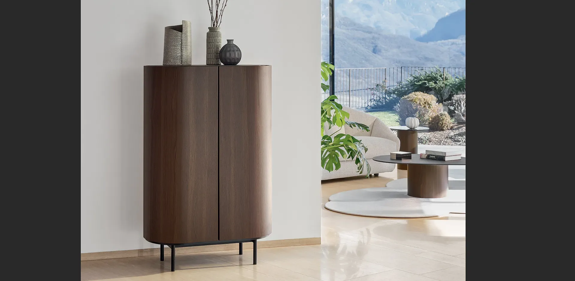
Combining a rectilinear body with rounded ends offers a compromise. Storage remains efficient while the extremities feel softer. A curved niche within a geometric wall can also introduce variety without compromising organisation.
Materials suited to curved forms
Bent timber, routed panels, folded metal, shaped glass, and composites support different radii. Each technology affects thickness, continuity, and fabrication. A well-executed curve should remain uniform without tension or accidental joints.
Timber reveals grain direction. The grain can follow the shape or create contrast, but needs control. Uniform lacquers emphasise light and outline. Metals and glass produce stronger luminous variation.
Straight geometry accepts a wider material range and simplifies cutting and joining. On minimal surfaces, corner precision is highly visible. Edges, gaps, and alignments need coherence.
Light, shadow, and volume
On curves, light produces gradual transitions. The volume changes throughout the day and appears less static. Satin or tactile finishes emphasise variation without excessive glare.
At corners, the boundary between light and shadow is sharp and makes geometry legible. Grazing light can emphasise gaps and depth, while diffuse light softens contrast. Lighting design can therefore strengthen or reduce the formal language.
Every curve or edge does not need dramatic illumination. Establish a hierarchy by selecting the main volume and leaving others quieter. Light should support use and atmosphere.
Colour and continuity
Uniform colour makes outline prominent. On a curved form, one colour reveals continuity; on rectilinear furniture, it emphasises precision. Tones similar to the wall integrate, while strong contrasts increase presence.
Colour can connect different geometries. A curved armchair and precise sideboard in the same colour family appear coordinated without imitation. Shared materials can also unite forms through texture and temperature.
A limited palette prevents the comparison between curves and corners from becoming confusing. If form, colour, and material all change simultaneously, continuity disappears. Retain at least one constant.
Combine curves and corners with balance
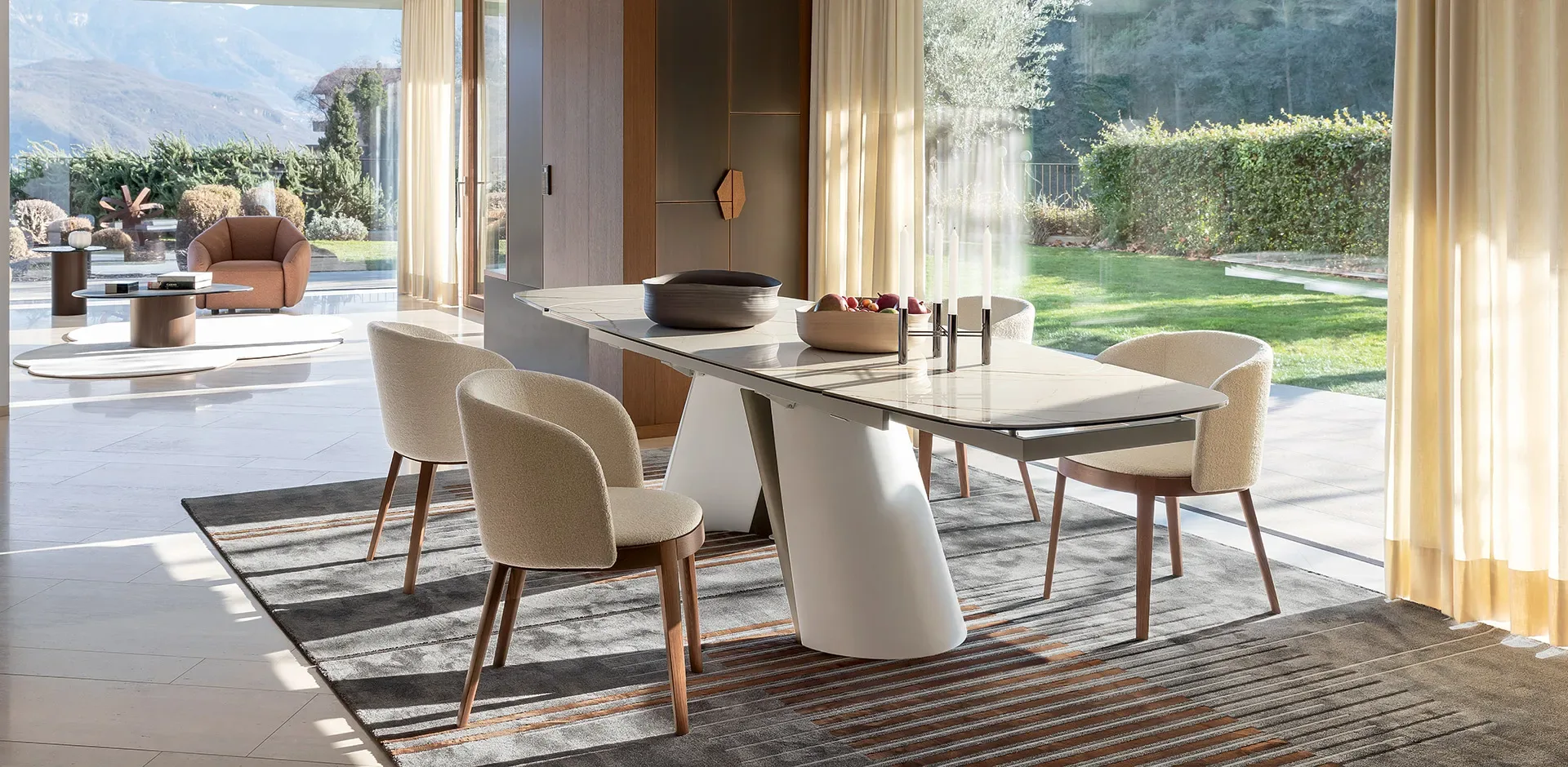
A living room does not need a single language. Curves can become accents within an orthogonal structure. A round table, enveloping chair, or softened end interrupts rigour without cancelling it.
The reverse works when a room dominated by organic forms needs stability. A linear sideboard, rectangular rug, or precise shelf introduces order. Contrast needs hierarchy: one family dominates and the other completes.
Repeating a curve in two or three places creates continuity. The same applies to alignments. Exact duplication is unnecessary; a radius, direction, or proportion may be enough.
Proportion and scale
A small curve on large furniture may look decorative; a broad curve changes its whole presence. The corner of a low volume has a different impact from that of a tall column. The decision needs to be assessed at room scale.
Floor templates and models help communicate footprint. Curved forms are difficult to imagine from width and depth alone. Mark the real outline and observe the remaining space at its narrowest points.
Viewing distance matters too. Fine details appear nearby, while overall geometry is read from the entrance. Coherent design works at both scales.
Relationships with rugs, tables, and lighting
A rug can reinforce or mediate. A rectangular rug organises curved seating; a round format creates a centre in an orthogonal room. Dimensions should include the entire zone and avoid small forms that appear added afterwards.
Tables should respond to routes. Round shapes simplify movement and serve seats in several directions. Rectangular formats provide efficient surfaces and align easily. Height and distance remain more important than outline alone.
Curved or linear lamps can reference the language without duplicating it. A literal match between every object is best avoided. Coherence comes from a limited number of recognisable relationships.
Maintenance and durability
Continuous curved surfaces can be easy to clean because they lack internal corners, but edges and finishes need care. Complex shaped elements may be more difficult to repair or replace. Component availability matters.
Rectilinear furniture has junctions and corners where dust and impacts may concentrate. Durable edging, adjustable hardware, and restorable materials increase life. A damaged corner is often highly visible on an essential surface.
Formal choice should consider intensity of use. Refined geometry that demands care incompatible with the household will quickly lose quality. Aesthetics and maintenance need alignment.
Mistakes to avoid
The first mistake is selecting curves merely because they seem softer. Without space and function, they become cumbersome. The second is adopting corners for rigour without considering routes and safety.
Mixing many shapes without hierarchy is equally risky. Circles, ovals, rectangles, and diagonals need a shared rule. Automatically copying room geometry may produce monotony; contrasting it without a criterion creates disorder.
Finally, do not assess only the external outline. Capacity, opening, ergonomics, and cleaning determine daily quality. Formal language should support use.
Choose a relationship, not a category
Curves and corners are design tools. Curves guide movement, modulate light, and introduce softness. Corners define order, use space efficiently, and create alignments. The best choice grows from the relationship with architecture and habits.
A balanced living room may be coherent or based on measured contrast. When proportions, materials, and routes are resolved, curves and precise geometry do not compete. They collaborate to make the room legible, comfortable, and personal.