
A minimal kitchen is not an empty kitchen: proportions, details and functionality
A minimal kitchen results from accurate proportions, resolved details and well-organised functions. This guide helps avoid interiors that feel anonymous or impractical.
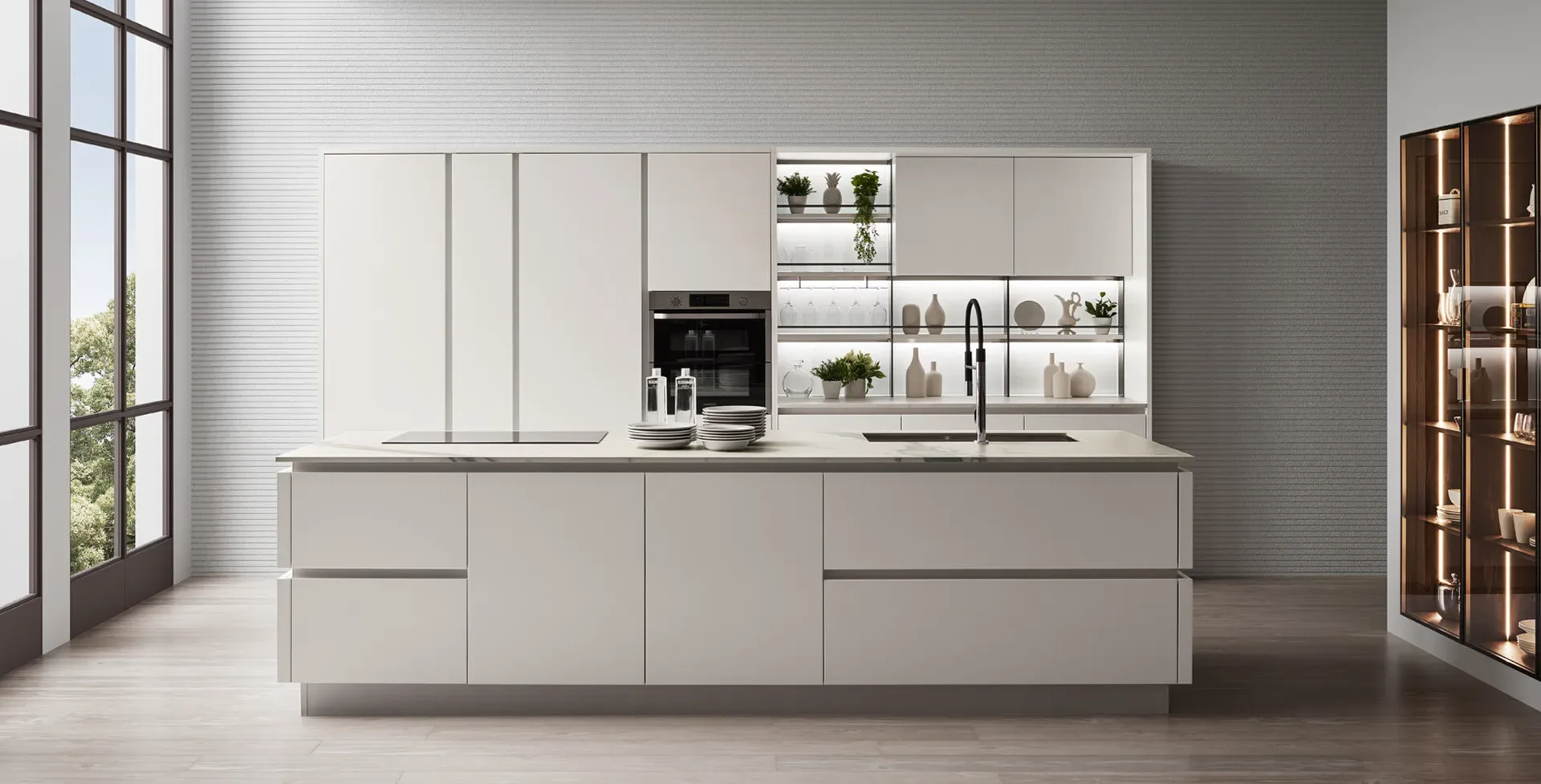
A minimal kitchen is not defined by the absence of objects, handles or colour. It results from rigorous selection: every volume serves a purpose, every line belongs to a hierarchy and every detail reduces perceived complexity without weakening use. Behind a restrained composition there may be extensive capacity, advanced equipment and tailored solutions, provided that they follow a clear design.
Confusing minimalism with emptiness often creates uncomfortable kitchens with insufficient worktops, reduced storage, inaccessible appliances and surfaces that remain ordered only in photographs. The project must absorb daily life. Visual simplicity, proportion and functionality should support one another, allowing the room to stay calm during use and return to order with few actions.
Minimalism as hierarchy
The first principle is distinguishing what should emerge from what can remain in the background. Principal volumes, worktop and openings build the visual structure; small appliances, utensils and supplies need precise positions. When everything receives equal emphasis, the kitchen becomes fragmented. When everything is concealed without thought, use becomes awkward.
An effective hierarchy may include:
- one continuous principal front;
- a clearly recognisable working zone;
- a limited material palette with distinct roles;
- technical elements integrated but accessible;
- internal storage calibrated to habits;
- one or two accents rather than numerous exceptions.
Minimalism therefore grows from ordered decisions, not from having very few decisions.
Design the layout before the image
Form should follow the room and its actions. A linear kitchen provides continuity but requires a careful sequence between storage, washing, preparation and cooking. A corner arrangement increases surface area but may create difficult zones. Parallel fronts are efficient when the passage supports openings and movement. Islands and peninsulas work only with suitable operating space on all necessary sides.
The layout should be tested with doors, drawers, dishwasher and oven open. Simultaneous use and the connection with table, living area and entrances need consideration. A simple plan should not create long routes or overlapping activities.
A minimal composition feels natural when organisation is coherent enough to require no visible correction.
Proportions create calm
Before finishes, heights, thicknesses and relationships between volumes determine balance. A low plinth makes bases appear more compact, a slender worktop emphasises horizontal lines, full-height columns turn storage into an architectural wall, and reduced wall units leave more air above the work surface.
No proportion suits every room. In a tall interior, volumes that are too low may appear incomplete; in a compact space, columns across every wall may create pressure. Dimensions must also respond to user stature, posture and reach.
Aligning principal levels creates continuity. Necessary exceptions, including a raised oven or niche, should enter the grid rather than appear added later.
A limited number of well-sized modules
A heavily divided elevation creates noise even in one colour. Repeating widths and concentrating special functions builds stable rhythm. Uniformity must not compromise the interior, since drawers, dishwasher and appliances have different requirements.
The solution is coordinating external lines without forcing functions. Broad fronts can conceal articulated interiors, adjacent columns can share alignments, and handle channels can unify different heights.
Modularity should remain legible and support replacements, adjustment and adaptation.
Detail does not disappear
In a restrained kitchen, detail becomes more important because decoration does not conceal it. Joints, edges and connections with walls and floor need precision. A small irregularity interrupts a long line and becomes immediately visible.
Handles, channels and push-to-open systems have ergonomic consequences. Removing handles creates continuity but should not make heavy fronts difficult to open. A channel needs a comfortable grip and easy cleaning, while pressure hardware must remain reliable and adjustable.
Plinths, ventilation grilles and sockets also belong to the design. Concealing them improperly compromises safety and maintenance.
Materials: reduction without monotony
A limited palette need not feel flat. Different materials may share similar tones while differing in texture, reflection and depth. Quiet timber introduces warmth, a technical surface provides uniformity, and stone or ceramic defines the worktop.
Each material should suit its zone. Fingerprint-prone fronts, heat-exposed worktops, splashbacks near water and edges along circulation have specific performance requirements. One surface used everywhere may simplify the image but not necessarily daily use.
Real samples should be viewed with the room’s floor and light. Minor unintended differences are more disruptive than deliberate contrasts.
Colour and architectural continuity
Tones close to the wall can make columns appear architectural. Darker colours concentrated on an island or niche create depth. A minimal kitchen may also use a strong tone when distributed across clear fields rather than fragmented fronts.
The selection should be observed in daylight and artificial light. A dark surface absorbs light and reveals dust, while a pale one increases brightness but emphasises shadows and joints.
The colour of visible objects must be anticipated. When all contents remain exposed, even a controlled palette can become noisy.
Storage that clears surfaces
Clear worktops are achieved by assigning accessible positions to objects, not by removing them from daily life. Small appliances, utensils, spices, boards and cleaning products need locations close to their point of use and easy to restore.
Deep drawers, pantry columns, pull-out trays and internal dividers can organise different categories behind continuous fronts. Corners need access solutions, while very broad compartments without subdivisions become accumulation zones.
A station for daily appliances may be screened with a retracting or sliding front, provided that ventilation, sockets and movement are adequate.
Invisible function and visible maintenance
Internal organisation may be complex, but it should simplify actions. Pots near cooking, tableware near the table or dishwasher, waste in the preparation zone and protected cleaners near the sink reduce movement. Frequent categories belong in the most accessible band.
Maintenance cannot be ignored. A uniform surface reveals marks and misalignment. Materials, joints and mechanisms should allow cleaning, adjustment and replacement. Drivers, traps, sockets and grilles need inspection access.
True restraint removes unnecessary actions rather than necessary access.
Appliances integrated with purpose
Integrating appliances into fronts creates continuity, but every device needs ventilation, opening clearance and service space. Oven height should support visibility and safety, the refrigerator belongs near the food entrance route, and an open dishwasher should not block circulation.
Visible appliances can coordinate through finish and alignment. Concealing everything is not mandatory; a well-proportioned technical element can join the composition without dominating.
Small appliances used frequently should not occupy inconvenient compartments. Frequency of use matters more than photographic purity.
Worktop: continuity and performance
The worktop is the preparation zone and needs sufficient continuous area between sink and cooking. Joints, material changes and appliances should not reduce its operating surface. Thickness affects appearance but must relate to material, clear span and fabrication.
Resistance to heat, stains, impact and scratching varies. No surface is entirely maintenance free. Understanding limitations and cleaning methods prevents unrealistic expectations.
An integrated sink and continuous splashback reduce interruptions but require precise installation and details suited to water.
Illuminate work and architecture
A minimal kitchen may feel flat or dark when lighting is inadequate. General light should be combined with sources on the worktop, beneath wall units or within shelves. Placement must prevent the user’s body from casting shadows, and sources need screening.
A secondary layer can emphasise a niche, volume or dining area. Scenes should remain separate because decorative lighting cannot replace task illumination. Good colour rendering and consistent temperature support accurate perception of food and materials.
Profiles and drivers should be discreet but accessible. Even when switched off, components need to belong to the design.
The kitchen open to the living area
When kitchen and living functions share a room, visual simplicity creates continuity. A wall of columns may become an architectural background, while an island or table defines transition. Materials and colours can relate to the living area without duplicating it.
Noise, odours and views towards working surfaces need consideration. Effective extraction, quiet appliances and adequate storage improve coexistence.
Clearing the worktop after use allows the kitchen to change presence throughout the day.
Personalisation without unnecessary decoration
Minimalism does not exclude personality. It may emerge through the proportion of an island, a textured finish, the colour of a niche, a precise handle or the relationship between light and surface. Concentrating character in few elements increases its value.
Internal organisation is another form of personalisation. Heights, accessories and distribution can respond to habits without altering external clarity.
Elements connected to current taste should be easy to change, including seating, lamps, textiles and objects. Principal volumes and worktops require more durable decisions.
Sustainability and durability
Reducing the material palette can simplify maintenance and separation, but longevity depends mainly on quality and repairability. Adjustable hinges, replaceable fronts, correctly installed worktops and available parts extend useful life.
A kitchen that remains functional does not require complete renewal. Adaptable interiors and spare capacity support changing habits. Accessible appliances can be replaced without damaging cabinets.
Formal restraint supports longevity when it avoids features tied to short-lived fashions.
Mistakes to avoid
The first mistake is removing wall units and storage without checking quantities. The second is selecting uniform fronts while neglecting ergonomics and maintenance. Using delicate materials solely for continuity also creates an order that is difficult to preserve.
Other recurring problems include:
- worktops that are too short;
- openings without adequate grip;
- insufficient sockets;
- no place for small appliances;
- decorative but weak task lighting;
- imprecise joints and alignment;
- columns too massive for the room;
- interiors without dividers;
- services with no inspection access;
- no spare capacity.
The kitchen should be assessed during use rather than only when empty.
The essential as a complete system
A minimal kitchen succeeds when it contains everything required and makes it easy to use. Proportions, details and functionality build an order that does not depend on the absence of daily life. Surfaces can remain calm because internal organisation absorbs objects and activity.
The most durable form of restraint does not impoverish; it clarifies. It removes unnecessary repetition, coordinates materials and lines, concentrates personality and keeps technical functions accessible. The result is a kitchen full of possibilities, yet visually balanced and capable of supporting the home over time.


