Geometry and volume: designing a storage wall with sculptural character
A storage wall can gain architectural presence through rhythm, depth and proportion. Discover how to create character without sacrificing function or visual order.
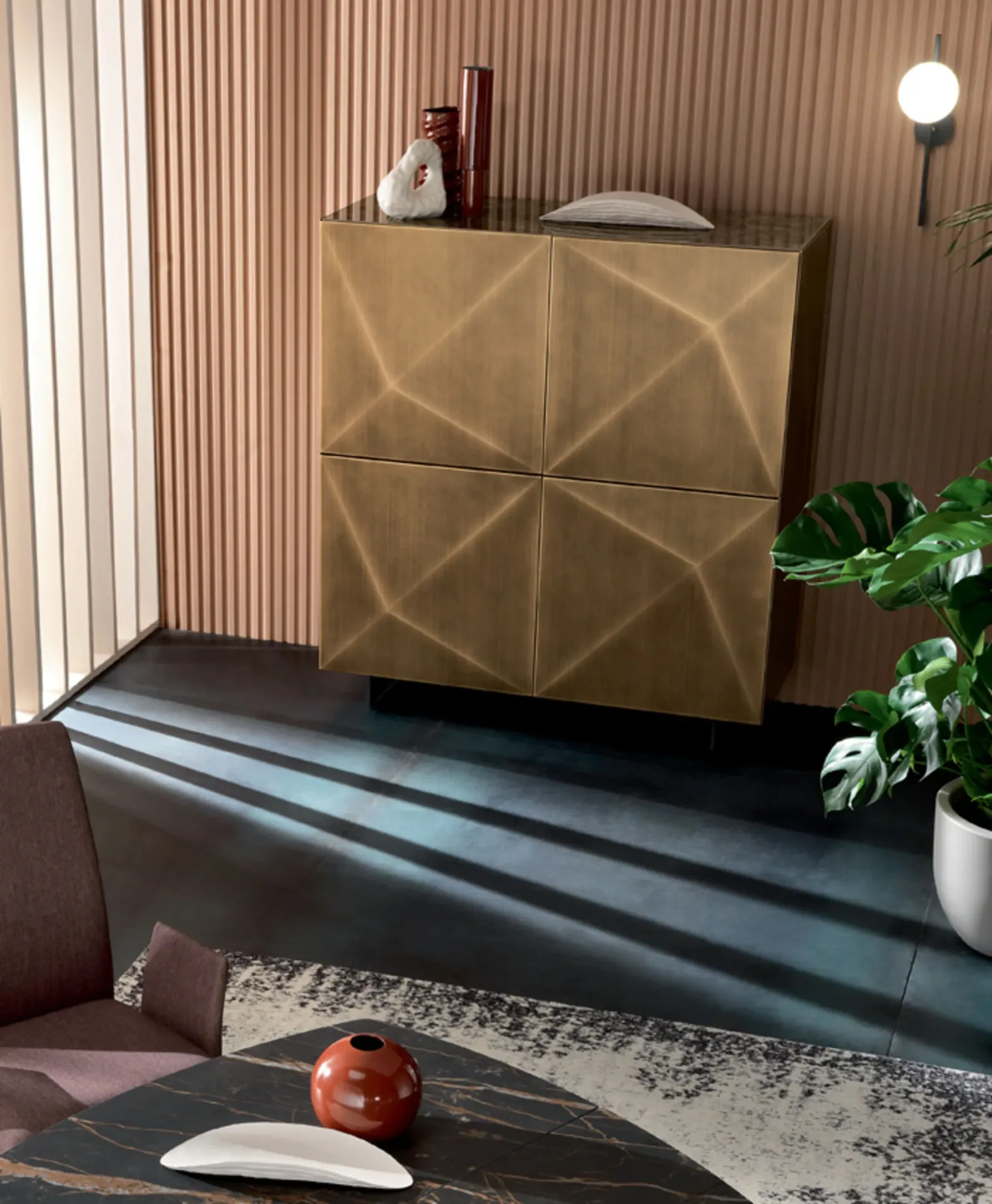
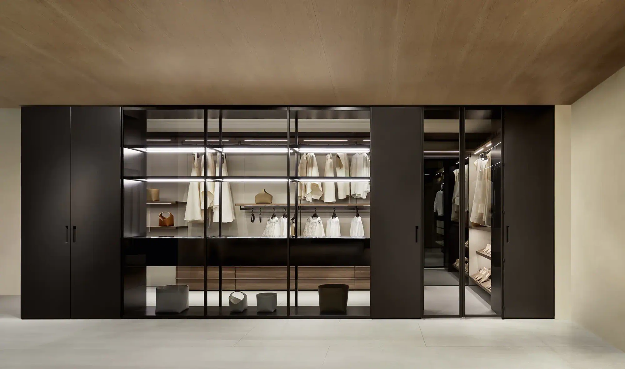
A storage wall can go beyond simple containment and become an architectural presence that organises the living room. Sculptural character does not come from accumulating unusual forms, but from the precision with which solids, voids, depths, materials, and light create a composition. The wall must store objects, integrate technology, and maintain a balanced relationship with the room.
The most effective design begins with functions and translates them into a visual hierarchy. Closed compartments, niches, shelves, bases, and panels should not be assembled as unrelated elements. They need to contribute to one design. When rhythm is clear, even a broad structure looks orderly; without proportion and alignment, the result becomes fragmented.
Read the wall as part of the architecture
Before defining modules, survey the wall, room dimensions, and views. Doors, windows, columns, beams, sockets, switches, radiators, and service routes create limits and opportunities. An existing recess can become an integrated volume. A column can be absorbed into the composition. An irregular wall requires precise compensation.
The wall should be viewed from the entrance, sofa, dining area, and connected rooms. Geometry that works from the front may seem unbalanced from one side. Ceiling height and daylight also affect how much volume can be introduced without compressing the living room.
Draw elevation and plan together. The elevation clarifies rhythm and proportion; the plan reveals projections, circulation, and relationships with furniture. Three-dimensional models or full-size templates help communicate masses that a flat drawing cannot fully convey.
Define contents and functions before form
A sculptural wall must first work. List what it needs to hold: books, objects, tableware, documents, devices, a screen, audio equipment, or decorative pieces. Each category requires different depth, access, ventilation, and load capacity.
Objects that should remain hidden belong in closed compartments. Display pieces need proportionate niches and appropriate light. Technology requires cable routes, accessible sockets, and heat dissipation. Books are heavy and demand correctly dimensioned shelves.
Separating daily use from display reduces disorder. The most accessible compartments should contain frequently used items, while high areas can hold light or occasional objects. Form then grows from genuine function rather than a graphic gesture applied afterwards.
Establish a hierarchy of volumes
Every composition needs a dominant element. It may be a large niche, suspended volume, long base, or vertical panel. Other components should support it through repetition, alignment, and differences of scale. If all modules carry equal importance, the wall appears uniform or chaotic.
Hierarchy may come from size, colour, depth, or light. A darker niche visually recedes. A projecting pale block gains presence. A continuous shelf links separate parts. Variations should be limited and deliberate.
Asymmetry can also be balanced. A large volume on one side may be countered by open space, a sequence of shelves, or a low element opposite. Balance does not require mirroring but a credible distribution of visual weight.
Treat solids and voids as design material
Void is not leftover space between cabinets. It is an active component that lets the composition breathe, creates depth, and provides places for display or light. A niche can frame an object, a free area of wall can interrupt rhythm, and a gap below the ceiling can lighten the whole.
Solids provide capacity and visual stability. Concentrating them in the lower band grounds the wall and makes upper parts lighter. Distributing them vertically emphasises height. Alternating open and closed compartments too frequently creates noise, so legible groups are preferable.
Void proportions should relate to contents. A very large niche containing a tiny object looks accidental. A compartment filled completely loses its role. Anticipating the amount and scale of display is part of the design.
Use different depths to create sculptural perception
Three-dimensionality comes mainly from changes in depth. A recessed panel, projecting cabinet, or thin shelf creates distinct planes and shadows. Subtle differences may be more refined than major steps, particularly in compact living rooms.
Every projection must respect circulation. Deep modules near doors or routes can become obstacles. Upper elements require attention to both perception and safety. A strongly projecting volume above seating may feel oppressive even when structurally secure.
Depths also need to correspond to functions. Books, devices, and decorative objects do not require the same space. Coordinating internal needs with external planes produces articulation without adding thickness merely for effect.
Orthogonal, diagonal, and curved geometry
Orthogonal geometry connects easily with architecture and supports order. Alignments with doors, flooring, and furniture make the wall part of the room. Variety can come from rectangle proportions, depths, and materials without complex forms.
Diagonals and inclined elements increase dynamism and need greater control. They can guide the eye or disrupt an overly rigid grid, but quickly become dominant. Limit them to one main gesture and allow the rest of the composition to support its direction.
Curves soften transitions between volumes and alter shadows. They require precise fabrication and enough room to be perceived. Random or numerous curves weaken clarity; one carefully connected surface can create identity without excess.
Module, grid, and rhythm
An invisible grid helps preserve coherence. Widths, heights, and gaps can derive from a base module even when the composition appears free. Repeating selected dimensions creates rhythm and simplifies the integration of doors, drawers, and shelves.
The grid does not need to be obvious. A larger niche or continuous panel may interrupt it when the exception has a role. Without an underlying rule, every difference looks arbitrary. With a strong structure, even an irregular element appears intentional.
Rhythm should be assessed across the whole wall. Too many gaps increase fragmentation. Broader fronts and continuous alignments reduce noise and strengthen architectural character.
Materials and surface continuity
One dominant material unifies different volumes. Matt lacquers create compact surfaces and reveal shadows. Timber adds warmth and direction through grain. Stone, ceramic, glass, and metal can introduce accents or protect specific areas.
Continuity matters across large fronts. Grain, gaps, and finish changes should follow the geometry. A contrasting material can emphasise a niche or base; too many changes make the wall resemble a sample display.
Touch matters too. Frequently opened zones need surfaces that resist fingerprints and have pleasant edges. Delicate materials can be reserved for less exposed panels. Sculptural quality needs to remain compatible with everyday life.
Colour and visual weight
Colour changes the perception of volumes. Tones close to the wall integrate the structure and soften its mass. Strong contrast reveals every module and reinforces the design. Dark shades may recede in some light but can also appear more compact. Pale colours increase brightness and produce softer shadows.
A limited palette supports legibility. One base colour, one tactile finish, and one accent are often enough. Variations of the same tone can distinguish planes without fragmentation. Tests should be carried out in actual light because sheen and saturation change greatly between day and evening.
Colour can correct proportions. A darker low band grounds the composition, while upper parts close to the wall tone feel lighter. The aim is not to hide the storage wall but to control its presence.
Integrate a screen without letting it dominate
When the wall holds a screen, that device should not determine every proportion. Its size should relate to viewing distance, while the background panel, compartments, and base need to create a composition that remains valid when the screen is off.
An overly precise niche may restrict future upgrades; excessive space makes the device look isolated. Provide margins, ventilation, replaceable cables, and socket access. Adjustable supports and technical panels should remain inspectable.
Lighting near the screen must avoid glare and excessive contrast. Indirect light on the background reduces visual fatigue and adds depth. Connected devices require ventilated compartments and accessible controls.
Integrated lighting and shadows
Light reveals depth and materials. Linear sources within niches can emphasise geometry when they are continuous and concealed. Adjustable spots highlight selected objects. Diffuse light behind a panel separates planes.
It is better to design a few coherent effects than illuminate every compartment. If all niches have equal intensity, hierarchy disappears. Light should support the dominant element and create quieter areas.
Wiring, drivers, heat dissipation, and maintenance need planning. Sources should be replaceable without dismantling the wall. A colour temperature consistent with other living-room lighting keeps materials and colours uniform.
Openings and concealed hardware
Essential fronts require precise hardware. Push systems, channels, and integrated handles preserve continuity but must provide a comfortable grip. Large doors need suitable adjustable hinges, and wide drawers require runners with sufficient capacity.
Gaps become part of the design. Alignments between closed and open elements should remain precise over time. Adjustable doors and drawers make it possible to correct settling. Minimal character makes every change more visible.
Openings must not interfere with furniture, circulation, or nearby modules. Simulating doors and drop-down fronts on plan prevents collisions. Sculptural form should be experienced without awkward gestures.
Relate the wall to floor, ceiling, and sides
A storage wall can meet the ceiling and appear built in, or leave a margin and read as a large piece of furniture. The first approach maximises capacity and architectural continuity. The second lightens the structure and makes volume easier to read. The choice depends on height, dust, services, and proportion.
The floor relationship creates similar effects. Suspended bases reveal the surface and simplify some cleaning tasks. Continuous plinths communicate solidity and conceal adjustment. Connections with side walls should avoid accidental gaps through fillers, intentional distances, or shadow profiles.
Building irregularities require accurate surveying. Walls and ceilings are rarely perfectly square. Planned compensation preserves alignment without forcing modules.
Display and control of disorder
Open compartments create depth, but their contents continually change the composition. Select a limited number of objects, alternate heights, and retain free space. Books and collections can be grouped into legible masses instead of spread uniformly.
Closed storage should absorb everything that does not support display. Cables, controls, documents, and daily accessories need dedicated compartments. Without this capacity, niches quickly become deposits.
A sculptural wall does not need to remain static. It can support change if its structure provides a robust hierarchy. Adjustable shelves and flexible lighting allow objects to evolve without losing order.
Maintenance and technical access
Geometric complexity increases places where dust collects. High shelves, deep niches, and staggered surfaces need to remain reachable. Reducing unnecessary projections and providing removable panels simplifies care.
Materials and finishes require compatible products. Soft cloths and regular cleaning avoid aggressive intervention. Areas near electronics should remain ventilated and free from build-up.
Services, drivers, and supports need inspection access. A concealed but simple opening permits repair without damaging furniture. Durability and sustainability also depend on the ability to replace components and update technology.
Mistakes to avoid
The first mistake is starting with form without understanding contents. A dramatic wall without suitable capacity loses order. The second is using too many depths, materials, and colours. Complexity is not the same as sculptural character.
Filling the whole wall is also risky. Open space is necessary to read volumes and respect the architecture. Neglecting routes, openings, and maintenance produces an inconvenient composition. Illuminating every niche with equal intensity removes hierarchy as well.
Finally, do not consider the elevation alone. Projections and doors alter the floor plan. A complete design verifies use, views, and movement before defining the final appearance.
A functional sculpture for everyday life
A storage wall gains sculptural character when function and form coincide. Geometry, volume, void, and materials should organise daily life while creating a precise presence in the living room.
Quality does not depend on spectacle but on clear hierarchy, careful proportions, and durable details. When storage, light, and architecture work together, the wall becomes a functional sculpture: authoritative, orderly, and genuinely useful.