
Modular sofas: criteria for creating a balanced configuration
Dimensions, modules, end units and circulation must work together. This guide shows how to create a sectional sofa proportioned to its setting and everyday use.
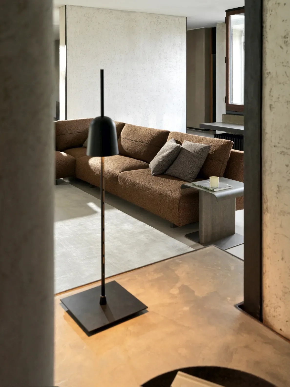
A modular sofa can adapt the conversation area to the size of a room, everyday habits, and future changes in the home. Yet this freedom is not simply the ability to add more pieces. A successful configuration comes from a plan in which dimensions, circulation, proportions, and functions are coordinated. Every module needs a clear purpose and should contribute to an arrangement that is legible, comfortable, and consistent with the architecture.
Balance does not necessarily mean symmetry. A composition may be linear, corner-based, open, or deliberately asymmetrical and still feel ordered. What matters is the relationship between occupied and empty space, the continuity of the seating, the distribution of visual weight, and the ease with which people can enter, sit down, talk, and move around. Before choosing individual elements, it is therefore useful to see the living room as a system rather than as an area that needs to be filled.
Start with the room, not the list of modules
The first criterion is to measure the space that is genuinely available. Length and width are not enough: doors, windows, radiators, columns, sockets, routes to adjoining rooms, and opening arcs must all be recorded. The position of daylight and evening light sources also influences how the composition will be perceived and used.
A scale drawing makes it possible to test dimensions without relying on intuition. Circulation zones should be drawn as carefully as the sofa perimeter. In a frequently crossed living room, the main route needs to remain clear and continuous. In a more secluded area, an enveloping layout may be appropriate, provided that access to the seats does not become awkward.
The room should be considered from several viewpoints. A configuration that seems balanced from the front may look excessively solid from the entrance or interrupt the connection with the dining area. Marking the footprint on the floor with removable tape helps communicate its true size, while boxes or lightweight templates can simulate the height of backs and arms. This simple test reveals what written dimensions often conceal: volume also occupies the field of vision.
Define the main purpose of the conversation area
The configuration should reflect how the living room is actually used. If conversation is the main activity, the seats need to encourage eye contact and avoid excessive distances. If the space is mainly intended for relaxation, depth, support, and the possibility of stretching out become central. In a multifunctional interior, different orientations may be useful, as long as they do not fragment the whole arrangement.
Before composing the system, answer a few practical questions. How many people use the living room every day? How many guests are regularly welcomed? Is the room used for reading, watching a screen, occasional work, or primarily for talking? Are there children or pets? Are nearby surfaces needed for books, drinks, or devices? The answers separate genuine requirements from additions prompted merely by the availability of another module.
One more seat does not automatically improve the design. It may remove room for a table, narrow a route, or create a place that is difficult to reach. Modularity is most effective when it enables selection, not accumulation. The right number of elements is the one that supports the intended activities while preserving enough empty space for the room to breathe.
Choose the compositional scheme
A linear configuration is the easiest to control. It works well along a wall or in the centre of a room when the back is appropriately finished and proportioned. Its clarity makes it easy to coordinate with armchairs, tables, and storage, although its total length requires care: an excessive sequence can become a visual barrier.
A corner scheme defines a sheltered area and uses two directions. It is particularly helpful when the living room needs to be distinguished without building partitions. The corner, however, should not be treated simply as a way to occupy more floor area. The internal seat must remain usable, access should feel natural, and the longer side should not dominate the room disproportionately.
An open configuration, using an armless end or an extended element, softens the boundary between the sofa and its surroundings. It can guide movement towards a window or dining area and create a more fluid perception. Facing arrangements and island layouts suit larger interiors, but their distances must be carefully calibrated. If they are too close, the area feels compressed; if they are too far apart, conversation becomes less comfortable.
There is no universally superior scheme. The choice depends on the orientation of the room, the position of focal points, and the desired degree of separation. The most balanced design is the one in which the sofa geometry clarifies the use of space instead of conflicting with it.
Establish a hierarchy between modules
Every composition needs a dominant element and supporting parts. The centre may be the main run of seats, a corner, or a core directed towards the focal point. The other modules should extend, complete, or lighten this structure. If every element attempts to attract attention in the same way, the result looks fragmented.
Hierarchy can be created through different lengths, controlled changes in depth, or end pieces that conclude the composition. Arms and backs also contribute to the rhythm. A substantial arm can give stability to one end, while an open terminal makes the other feel lighter. Regular repetitions communicate order; measured variations introduce movement.
Asymmetry demands particular precision. To work well, it must be counterbalanced rather than accidental. An extended element on one side can be balanced by a lamp, a table, an armchair, or a greater amount of open space on the other. Balance does not imply mathematical equality. It describes a perceptual equivalence between different visual weights.
Control proportions, depth, and height
Modules need to be proportionate both to one another and to the room. Very deep seats offer a relaxed posture, but they occupy substantial floor area and may not suit people who prefer more upright support. Compact units simplify circulation, but they should not reduce comfort beyond the desired level. The correct criterion lies at the intersection of ergonomics and available space.
Height changes perception as well. Low backs preserve sightlines and work well in central compositions; more supportive backs define the area more strongly and offer a different type of comfort. Wide arms increase the overall footprint, while slimmer solutions free useful centimetres. When repeated along an extensive configuration, these details make a considerable difference.
The relationship between total length and nearby walls should also be checked. Side margins allow the volume to breathe and leave space for curtains, lamps, or small accessories. A sofa that almost exactly matches the wall can appear trapped even when it technically fits. Conversely, a composition that is too small for a large room loses presence and makes the remaining furniture difficult to organise.
Design occupied space, empty space, and circulation
Empty space is an active part of the configuration. The area in front of the seats allows people to stand, reach a table, and cross the living room. Lateral space separates the sofa from walls and furniture. The zone behind it may become a route or a connecting strip between different functions. Reducing every interval to the minimum creates a congested interior.
Distances should be assessed in relation to use. A coffee table must be close enough to be practical but not so close that it obstructs legs. An armchair can complete the conversation area without closing its entrance. If the sofa divides the living and dining zones, its back should leave sufficient passage and present an orderly surface, because it will be as visible as the front.
Special attention is needed where two modules change direction. A corner may become a comfortable seat or an underused area depending on its depth, cushions, and accessibility. Tables, footstools, and other accessories should not make it difficult to reach. The quality of a composition is also revealed by its least obvious points.
Coordinate upholstery and construction details
Visual continuity depends on the way upholstery, seams, cushions, and the base extend across the different modules. A single material reinforces the reading of the whole and highlights its geometry. Contrasting colours or textures can distinguish functions, but they need a clear rationale and a restricted palette if visual disorder is to be avoided.
Daily use should be considered before making an aesthetic choice. Fabrics with good abrasion resistance suit intensively used living rooms. Pronounced textures add depth but may retain dust more easily. Uniform surfaces can make creases and tonal variations more noticeable. Removable covers simplify some maintenance tasks, provided that their cleaning requirements are compatible with household routines.
Connections are equally important in modular systems. The elements should remain aligned during use while still being separable when the configuration changes or the floor needs cleaning. It is wise to understand how the connectors work, whether the floor remains accessible, and whether compatible components are likely to remain available. The longevity of the design depends on details that are rarely visible.
Integrate tables, rugs, and lighting
The sofa is not an isolated object. A rug can unify the conversation area, but its size should correspond to the complete composition. A rug that is too small concentrates everything in the centre and makes the modules appear disconnected. A well-proportioned format creates a shared base and establishes a relationship with armchairs and tables.
Tables should serve the different seating positions. In a long composition, one central surface may not be sufficient. Several lighter pieces with coordinated heights and dimensions offer flexible use without adding excessive weight. Even so, circulation needs to be preserved, and every available gap does not have to be occupied.
Lighting completes the hierarchy. Diffuse illumination establishes the general atmosphere, while reading lamps or adjustable sources support specific activities. Floor lamps and pendants should be positioned so that they do not interfere with modules, circulation, or sightlines. Electrical outlets deserve early consideration as well, especially when the composition is placed away from the walls.
Plan for change and maintenance
A configuration that is balanced today should remain useful when some needs change. Before purchasing, imagine at least two plausible arrangements: the main layout and an alternative. Not all modules are equally independent. Some work only beside specific units, while others can become separate seats. Understanding this distinction prevents the system from being credited with flexibility that it does not possess in practice.
Reconfiguration also needs to be realistic. If the pieces are very heavy, the connectors difficult to reach, or the floor delicate, frequent changes may prove impractical. The most useful form of modularity is not necessarily rearranged every week. Its value may be the ability to let the home evolve without replacing the entire seating system.
Cleaning should be treated as part of the design. Gaps, connections, and areas beneath the structure need to be accessible in relation to household requirements. Reversible cushions, replaceable padding, and properly maintained upholstery can extend aesthetic and functional quality. A well-designed configuration is not only attractive in its first photograph; it should remain orderly and comfortable over time.
Common mistakes to avoid
The first mistake is selecting the greatest possible number of seats. Nominal capacity does not describe the quality of use: places that are crowded or difficult to reach are rarely occupied. The second is ignoring total depth while focusing only on length. An extended element or corner can radically alter circulation.
Another mistake is positioning the sofa exclusively in relation to a screen, neglecting conversation, daylight, and the connection with the rest of the home. It is also risky to combine too many terminals, heights, or finishes without establishing a hierarchy. Variety should make the system more responsive to activities; it should not become an independent decorative objective.
Finally, a composition should not be judged only on a floor plan. Height, the mass of the backs, arm thickness, and colour all affect visual weight. Samples, templates, and tests in the room allow more informed decisions. The strongest design emerges from a sequence of checks, not from an improvised combination.
A balanced configuration is built through relationships
Creating a modular sofa means coordinating architecture, ergonomics, and habits. Quality does not lie in the number of elements but in the clarity with which each one contributes to the overall purpose. Accurate measurements, legible hierarchy, sufficient empty space, and consistent details turn a collection of modules into a genuine conversation area.
When the configuration supports circulation, encourages the desired postures, and works with rugs, tables, and lighting, the living room feels natural and ordered. Modularity then becomes a durable design tool: it allows the space to be personalised in the present and adapted thoughtfully in the future without sacrificing balance.


