Contemporary kitchen: how to combine visual simplicity and personalisation
Visual simplicity in the kitchen comes from coordinated choices, not from a lack of character. The article explores layouts, finishes, details and functional personalisation.
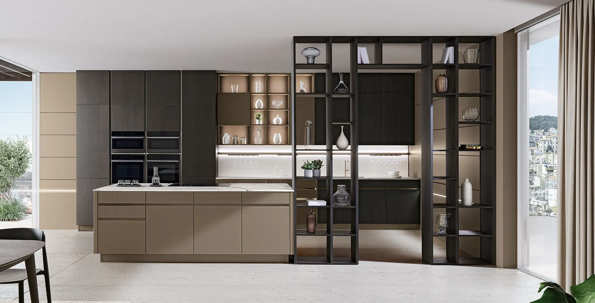
Contemporary kitchen: how to combine visual simplicity and personalisation
The contemporary kitchen often seeks strong visual simplicity: aligned fronts, continuous volumes, few materials and integrated details. This clarity, however, should not turn into impersonal uniformity. A kitchen is used every day by people with different habits, gestures and priorities; personalisation is therefore necessary to achieve ergonomics, capacity and a coherent relationship with the home.
Combining simplicity and personalisation means working with hierarchy. Functional choices may be numerous, but they must converge into a readable design. Character-defining elements should be concentrated in precise points, while technical and storage areas can be organised within a grid. The result is not an empty scene, but a complex environment made understandable through proportions, materials and coherent details.
Start from everyday gestures
Before defining colours and fronts, it is necessary to observe how the kitchen will be used. How many people prepare meals? Is cooking a daily activity or mainly a weekend habit? Are large surfaces needed for kneading, a breakfast area, space for small appliances or significant pantry storage?
The most meaningful personalisation comes from these questions. An effective project organises:
- food storage;
- washing and preparation;
- cooking;
- serving and dining;
- waste sorting;
- cleaning and maintenance;
- storage for tableware and equipment.
The sequence between functions should reduce movements and overlaps. Visual simplicity is credible only when it conceals a precise internal organisation.
Build a layout consistent with the space
The shape of the kitchen depends on the architecture. A linear composition maintains continuity and suits narrow rooms; an L-shaped configuration uses two walls but must solve the corner area well; two parallel fronts offer efficiency if the passage is adequate; islands and peninsulas require surrounding space and careful management of utilities.
The layout must be checked with doors, drawers, dishwasher and oven open. A passage that is sufficient in static conditions can become uncomfortable during use. The position of doors, windows, radiators and light points also influences the distribution.
Personalisation does not mean forcing an island into every room. It means choosing the configuration that best supports daily gestures and leaves the room with balanced proportions.
Reduce visual noise through a grid
A kitchen appears simple when the main lines are few and coordinated. Aligning tall units, wall units, base units and recessed handles creates a readable rhythm. Repeating modular widths and limiting interruptions prevents the elevation from becoming fragmented.
The grid must not compromise function. A drawer may require a different width, an appliance has its own dimensions, and a technical tall unit needs ventilation. These exceptions should be integrated by concentrating them and maintaining shared alignments.
The relationship between solids and voids also matters. A completely closed wall offers capacity but can feel heavy; an operational niche or a free band creates depth. Empty space must have a role, not be a leftover.
Personalise through proportions
Before colour, proportions define character. The height of the plinth, the thickness of the worktop, the size of wall units and the relationship between tall units and base units change perception. Low, horizontal volumes communicate openness; full-height tall units build an architectural wall; smaller wall units leave more breathing space.
Proportions must take into account the users’ height and the room’s ceiling height. A worktop that is too high or too low causes fatigue; deep wall units close to the face reduce comfort; massive tall units in a small room can feel compressive.
Personalising dimensions therefore means improving ergonomics and aesthetics together, not introducing arbitrary measurements.
Choose few materials with clear roles
Visual simplicity benefits from a controlled palette. Two or three material families are often enough: one for the main fronts, one for worktop and backsplash, one for accents or open elements. Each material should have both a perceptive and an operational function.
Matt surfaces reduce reflections and fingerprints, but require finishes suitable for intensive use. Woods and warm textures introduce depth, while stone, ceramics and technical surfaces can provide resistance in work areas. Metals and glass should be used carefully so as not to multiply design languages.
Real samples should be observed with the floor, walls and room lighting. Tones that are almost the same but not coordinated create more disorder than an intentional contrast.
Use colour as structure
Colour can personalise without weighing the composition down if it is assigned to defined fields. A wall of tall units can take on a compact tone; the island can become an accent; a niche can introduce depth. Distributing many colours across individual fronts, on the other hand, makes the design harder to read.
Neutral shades offer continuity and allow materials and objects to emerge. More intense colours can endure when they are linked to the architecture rather than to a short-lived trend. It is important to consider how they behave with natural and artificial light.
Visible contents also add colour. Shelves and open compartments should be limited to objects that are truly used and kept tidy.
Integrated details, but easy to access
Handles, recessed grips and opening systems influence both aesthetics and daily use. Integrated solutions lighten the design, but they must be comfortable, easy to clean and suitable for frequent use.
The most successful simplicity does not eliminate detail: it makes it coherent. Thicknesses, cuts, under-wall-unit lighting, sockets, internal accessories and joints between materials must be designed with the same care as the fronts.
A personalised and visually simple kitchen is created when every choice has a clear role: fewer random signs, more design precision.