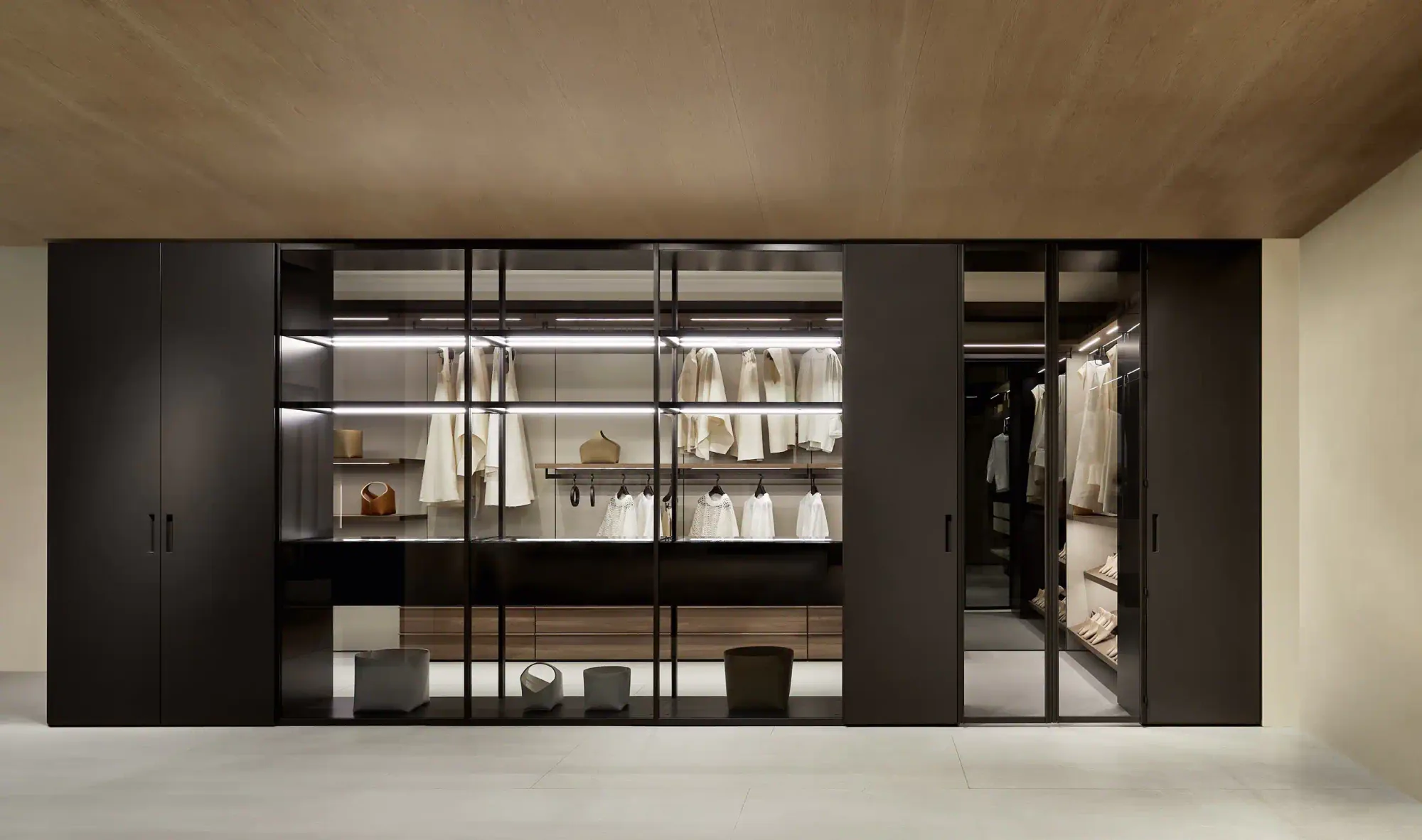
Open wardrobe: how to maintain order and visual coherence
An open dressing area requires consistent organisation, colour and lighting. This guide explains how to maintain clarity, everyday order and visual harmony.
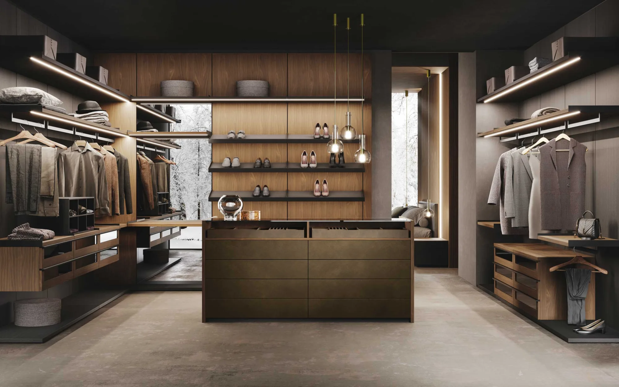
An open wardrobe makes clothes, accessories and personal belongings immediately accessible, but it also turns the contents into a visible component of the room. For this reason, adding more shelves or arranging a few hanging rails is not enough. The space needs a system in which organisation, proportions, materials and daily habits contribute to the same result. Order does not depend only on the discipline of the person using it. It mainly begins with a structure that gives every category a logical place, easy to reach and equally easy to restore.
Visual coherence does not require a flawless wardrobe or a rigidly controlled colour palette. It means reducing the noise caused by random heights, mismatched containers, scattered small items and overlapping volumes. A well-designed solution keeps useful and visually calm categories on display, protects the elements that tend to create clutter and establishes an understandable rhythm. The wardrobe can then become an integrated part of the bedroom rather than a storage area that simply happens to have no doors.
Begin with an honest inventory
Before defining modules and finishes, it is essential to understand what the space must actually contain. The inventory should distinguish at least between long garments, short garments, folded clothes, knitwear, underwear, shoes, bags, belts, jewellery, luggage and seasonal items. Quantities should also be recorded, because a generic distribution may devote too much room to minor categories and too little to dominant ones.
The survey must consider habits as well as objects. Someone who prefers to hang most clothes will need more rails and fewer deep shelves. A person who folds trousers and sweaters will require easily accessible compartments with controlled heights, so that piles remain stable. Everyday shoes should be separated from occasional footwear; small accessories need subdivisions; luggage can occupy the upper levels.
This analysis makes it possible to divide the contents into three zones:
- daily-use items, positioned between knee and eye level;
- frequently used items, accessible without awkward movements;
- seasonal or occasional items, placed in upper or peripheral areas.
When location reflects frequency of use, order requires fewer actions. A successful system shortens the route between taking something, using it and putting it back.
Establish a visual grid
In an open composition, uprights, shelves and rails create an internal elevation. Their arrangement should therefore follow a coherent grid. Aligning the main levels, repeating selected widths and limiting unnecessary variations makes the whole scheme appear calmer, even when clothes differ in colour and volume.
Regularity does not mean absolute uniformity. A wider compartment for coats or long dresses may interrupt the rhythm, provided that the variation has a reason and is visually balanced. It is better to concentrate exceptions in a few areas than to distribute special modules without hierarchy. Continuous horizontal lines unify the composition, while vertical lines define ordered fields and make categories easier to read.
The balance of solids and voids is equally important. Filling every centimetre creates pressure and makes garments difficult to move. Leaving some free space between hangers, above folded piles and across shelves allows the structure to remain visible. Empty space is not wasted capacity: it is both an operational and a visual margin.
Decide what remains visible and what should be screened
Not every category behaves in the same visual way. Shirts, jackets and hanging garments can form orderly sequences; underwear, accessories, cables, care products and small objects tend to produce fragmentation. An open wardrobe therefore works more effectively when it includes a proportion of closed or filtering elements.
Drawers, pull-out trays, coordinated boxes and opaque containers protect small belongings without sacrificing access. Fronts should follow the same dimensional logic as the shelves so that they do not look like later additions. When boxes are used, a limited number of compatible formats should be selected and repeated. Discreet labels can help, especially in upper zones, but they should not turn the space into a visually intrusive archive.
The decision between display and screening can follow a simple rule: show categories that naturally retain an orderly shape and contain those that frequently move or generate many details. This selection speeds up tidying and prevents the entire room from depending on an unrealistic level of everyday perfection.
Size hanging areas and shelves correctly
Dimensions should be derived from the garments. Rails for shirts, skirts and jackets can be arranged on two levels when height permits, whereas coats and dresses require a longer clear section. Before fixing the levels, it is useful to measure several real garments on the hangers that will be used. This avoids hems resting on shelves or excessive unused vertical gaps.
Shelves placed too far apart encourage tall, unstable piles; shelves placed too close together restrict flexibility. Modular adjustment makes it possible to revise heights over time. For knitwear, low stacks are easier to inspect and rebuild. In deep compartments, pull-out shelves or baskets can make the rear section accessible, preventing it from becoming a forgotten zone.
Shoes require attention to depth, ventilation and cleaning. Distribution according to frequency of use is more effective than purely aesthetic classification. Everyday pairs should remain visible without occupying the centre of the composition, while seasonal footwear can be stored in breathable, recognisable containers.
Control colour, hangers and density
Clothing inevitably introduces a broad range of colours. There is no need to arrange every item in a perfect gradient, but a stable classification improves both selection and perception. Categories can come first and colours second: shirts with shirts, jackets with jackets, lighter shades separated from darker ones. This method prevents appearance from undermining function.
Hangers are small details with a strong visual presence. Consistent models in terms of material, colour and thickness reduce discontinuity and keep shoulder lines aligned. Special hangers may be needed for trousers or delicate garments, but they should belong to a coordinated family. A cluster of empty hangers creates noise, so a dedicated location for them is preferable.
Density also needs control. An overloaded rail makes a garment difficult to remove and encourages creasing, overlapping and disorder. A modest amount of free space lets clothes breathe and makes them easier to return without pushing. The nominal capacity of a system is therefore not the same as its comfortable capacity.
Select a palette that supports the contents
Because the wardrobe already introduces many colours, its structure should provide a balanced background. Neutral tones, subtly grained woods, matt surfaces and controlled metallic details help to stabilise the composition. The result does not have to feel impersonal: it can relate to the floor, walls and bedroom textiles while keeping the number of finishes limited.
Very dark surfaces create depth and character, but they require carefully planned lighting and may reveal pale dust and fibres. Very light surfaces reflect more light, yet they can emphasise marks and shadows. Strong textures attract attention and are more effective as accents than on every component. The best finish is one that tolerates daily use and remains legible beside the clothes.
Continuity with the bedroom can be achieved by repeating one timber, tone or detail without copying every material. A measured relationship allows the wardrobe to belong to the same interior while retaining its distinct purpose.
Design light for visibility rather than decoration
Effective lighting must reveal colours and materials, prevent deep shadows and support movement. A central ceiling light is rarely sufficient because the user may cast a shadow directly onto the compartments. It is better to combine diffuse ambient light with sources integrated into or positioned close to the modules.
Vertical light lines distribute illumination evenly along hanging garments, while lights beneath shelves clarify drawers and work surfaces. Sources should be screened to avoid glare and distracting reflections. High colour rendering helps distinguish similar tones, and a colour temperature consistent with the bedroom maintains a comfortable atmosphere.
Presence sensors or local switching can simplify use without multiplying controls. Maintenance access must nevertheless be planned: drivers and wiring should not require the structure to be dismantled when components need attention or replacement.
Consider circulation, ergonomics and viewpoint
Visual order also depends on the distance from which the composition is seen. In a passage that is too narrow, the modules are perceived only in fragments and using them becomes uncomfortable. There must be enough room to open drawers, pull out accessories, turn the body and view several compartments at once. Where two storage fronts face one another, their opening paths should not conflict.
A mirror placed in the right position can enlarge perception and support dressing, but it may also visually double the amount of exposed content. Its orientation therefore needs careful consideration. A small clear surface for temporarily placing a garment is useful, provided it does not become a permanent accumulation point. Seats and ledges should respect circulation and have a defined purpose.
Ergonomics also includes personal reach. High rails may require lowering mechanisms; frequently used drawers should not be excessively low; everyday accessories should be available without repeated bending. A space that looks refined but is tiring to use will quickly become untidy.
Manage dust, ventilation and maintenance
Without doors, the contents interact more directly with the room. Fabrics and shelves consequently require regular cleaning, although the workload can be reduced through ventilation, easy-care surfaces and sensible garment rotation. Clothes should not be compressed against cold or poorly ventilated walls. A small gap supports airflow and limits stagnant conditions.
Materials must tolerate frequent contact, hanger movement and cleaning with gentle products. Simple joints, accessible edges and removable shelves make maintenance easier. Boxes used for seasonal storage should be cleanable and breathable; garments stored for long periods must be dry and protected.
A short weekly routine is more effective than an occasional major reorganisation: align hangers, rebuild folded piles, clear the temporary surface and return accessories to their compartments. At each seasonal change, quantities and categories should be reviewed, removing inactive items from the most accessible zones.
Allow the wardrobe to evolve
Needs change over time. A durable system should make it possible to move shelves, add accessories, revise heights and transform one section without disrupting the entire composition. Modularity is most effective when it remains governed by a grid; flexibility should not produce a random sequence of components.
It is wise to keep a modest reserve of capacity across rails, shelves and containers. Concentrating all free space in one compartment does not help the categories that later expand. Measurements should also be documented and unused components retained where practical, making future adjustments simpler and more accurate.
Mistakes that weaken coherence
One of the most common mistakes is designing around an idealised image instead of the real contents. Other frequent problems include too many open compartments, no dedicated storage for small objects, excessive density and lighting provided by a single source. Gradually introducing boxes, hangers and accessories without a shared criterion can also undermine the result.
Another error is treating every centimetre as capacity that must be exploited. Without margins, movements become difficult and the composition always looks overloaded. Finally, an order based only on colour can be visually impressive but impractical. Hierarchy should begin with categories and frequency of use, while colour provides a secondary layer of clarity.
Order designed to last
An open wardrobe remains coherent when its structure makes appropriate behaviour feel natural. Inventory, grid, the balance between displayed and screened areas, accurate dimensions, lighting and maintenance form a single system. The aim is not to hide daily life but to give it a clear and readable organisation.
The most convincing result is not a static room, but an environment that can absorb use without losing balance. When every object has a position suited to its frequency and form, restoring order becomes a short action. Visual quality then grows directly from functionality: the wardrobe remains accessible, personal and calm, even as it changes over time.